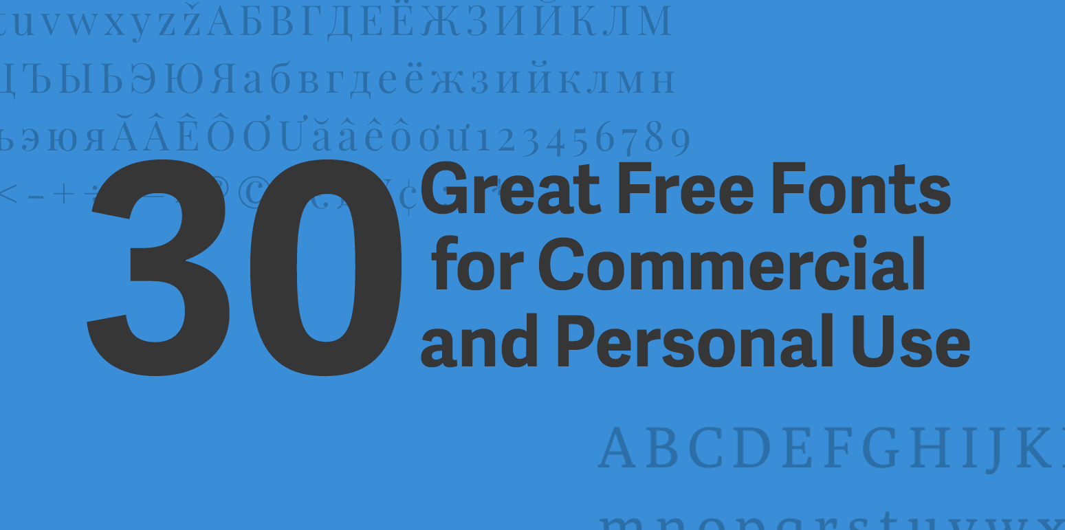
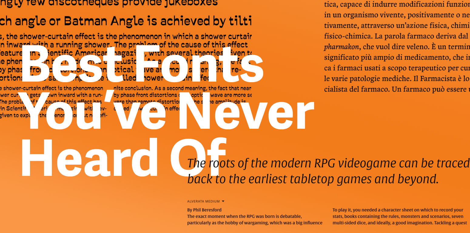
30 Great Free Fonts for Commercial and Personal Use
In a previous article, I highlight great free fonts available for download. Unfortunately, not all of the fonts can be used for commercial projects. So here is a list of the best free fonts you can download that are free for all use case scenarios (print, digital, commercial, etc.)
1. Poly
“Poly is a medium-contrast serif font. With short ascenders and a very high x-height, Poly is efficient in small sizes. Thanks to its careful balance between the x-height and glyph widths, it allows more economy and legibility than standard web serifs, even in small sizes”

2. Bitter
Bitter is a slab serif typeface designed for reading on screens. Bitter was designed by Sol Matas through the type collective Huerta Tipográfica.
3. Playfair
Playfair is a transitional design. Playfair is composed of letterforms of high contrast and delicate hairlines that were increasingly detached from the written letterforms. The Playfair project is led by Claus Eggers Sørensen, a type designer based in Amsterdam, Netherlands.
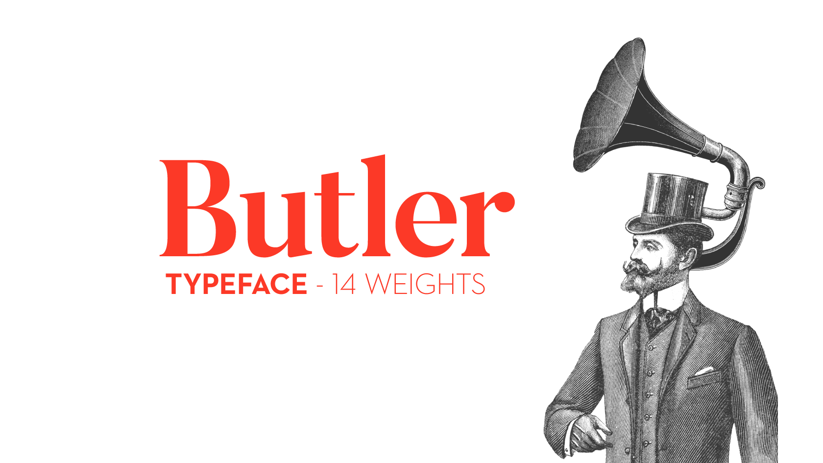
4. Butler
Butler is a free serif typeface inspired by a mix between both Dala Floda & the amazing Bodoni family. The main goal was to bring a bit of modernism to serif fonts by working on the curves of classical serif fonts and adding an extra stencil family.

5. Chivo
Chivo (‘goat’ in Spanish) is the first Omnibus-Type neo-grotesque, typeface family. It has 7 weight variants, plus matching italics. Its solidness and balanced strokes give Chivo both elegance and practicality. Chivo Regular works perfectly in long-reading texts, while Chivo Black is ideal for headlines, banners, and highlights. Developed by Héctor Gatti, this is an indispensable ally for any designer.

6. Aileron
Aileron is a neo-grotesque sans-serif created by Sora Sagano, of Tipotype. Aileron is available in 16 weights from ultralight to black.

7. PT Serif
PT Serif is a transitional serif typeface with humanistic terminals. It is designed for use together with PT Sans, and is harmonized across metrics, proportions, weights, and design.

8. Roboto
Roboto is mostly geometric sans on Google fonts. It has a mechanical skeleton and the forms are largely geometric. At the same time, the font features friendly and open curves. While some grotesks distort their letterforms to force a rigid rhythm, Roboto doesn’t compromise, allowing letters to be settled into their natural width. This makes for a more natural reading rhythm more commonly found in humanist and serif types.

9. Poppins
Poppins is a geometric sans typeface. With support for the Devanagari and Latin writing systems, it is an internationalist take on the genre. Many of the Latin glyphs (such as the ampersand) are more constructed and rationalist than is typical.

10. Signika
Signika is a sans-serif with a gentle character, developed for wayfinding, signage, and other media where clarity of information is required. It has low contrast and tall x-height to improve the readability of texts in small sizes as well as in large distances from the reader. Being a typical signage typeface it is inspired by typefaces such as Ronnia, Meta, and Tahoma.
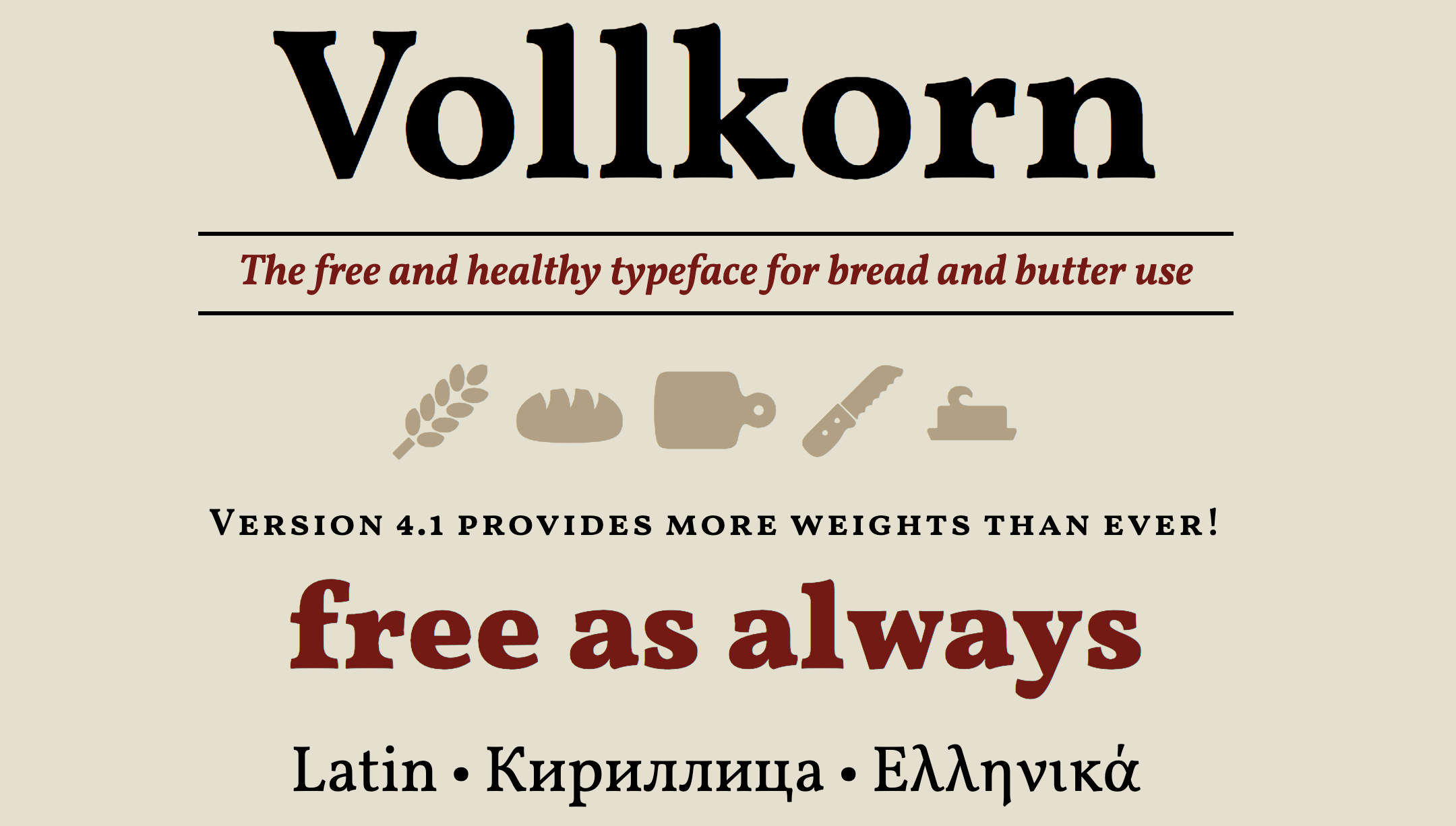
11. Volkorn
Vollkorn is a family of twelve weights in both regular and italic. Designed by German designer Friedrick Althausen.

12. Lora
Lora is a well-balanced contemporary serif with roots in calligraphy. It is a text typeface with moderate contrast well suited for body text.

13. Anodina
Anodina, created by Stefano Giliberti, is a font family with human features but symmetric in it’s soul. It includes 5 weights from Extra Light to Extra Bold. This font family is great for logo design, posters, basic text, headlines, and much more.

14. Space Grotesk
Space TIC, a three-weight proportional version of the original Space Mono, which proved to be a solid display typeface. Space TIC was later complemented with a single weight text version (Space TIC Text), which created a baseline for Space Grotesk.

15. Fivo Sans
Fivo Sans is a free neo-grotesque inspired by the International Typographic Style. Its voice is strong and smooth. Fivo was designed to be neutral, clean, simple and Swiss enough. That makes it perfectly suitable for texts and headlines, logotypes and posters.

16. Spectral
Spectral is a new and versatile serif face available in seven weights of roman and italic, with small caps. Spectral offers an efficient, beautiful design that’s intended primarily for text-rich, screen-first environments and long-form reading.

17. Lora
Lora is a well-balanced contemporary serif with roots in calligraphy. It is a text typeface with moderate contrast well suited for body text. Designed by Olga Karpushina and Alexei Vanyashi

18. Merriweather
Merriweather was designed to be a text face that is pleasant to read on screens. It features a very large x height, slightly condensed letterforms, a mild diagonal stress, sturdy serifs and open forms. The Merriweather project is led by Sorkin Type, a type design foundry based in Western Massachaussets, USA.

19. Prata
Prata is an elegant Didone typeface with sharp features and organic teardrops. There is a certain tension in the contrast of its virile serifs and soft refined curves. Its triangular serifs complement and accent the thin strokes, and the high contrast means it will work best in display sizes. Designed by Ivan Petrov for Cyreal.

20. Bebas Neue
Bebas Neue is a sans serif font family based on the original Bebas Neue free font by Ryoichi Tsunekawa.

21. Cabin
The Cabin font family is a humanist sans with 4 weights and true italics, inspired by Edward Johnston's and Eric Gill's typefaces, with a touch of modernism. Cabin incorporates modern proportions, optical adjustments, and some elements of the geometric sans.

22. Elaine Sans
Elaine Sans is a grotesque sans-serif forked from Work Sans fonts, version 2.001.

23. HK Grotesk
HK Grotesk™ is an Open Source sans serif typeface inspired by the classic grotesques. Geometry, metrics, punctuations and OpenType features have been updated to support a wide range of projects such as Environmental Signage, text face for books and magazines, Interface, Websites, and Mobile Applications.

24. Glacial Indifference
Glacial Indifference is an open-source typeface with inspirations from Bauhaus geometric fonts.

25. Noto Sans
Noto helps to make the web more beautiful across platforms for all languages. Currently, Noto covers over 30 scripts, and will cover all of Unicode in the future. This is the Sans Latin, Greek and Cyrillic family. It has Regular, Bold, Italic and Bold Italic styles and is hinted. It is derived from Droid, and like Droid it has a serif sister family, Noto Serif.

26. Noto Serif
Noto helps to make the web more beautiful across platforms for all languages. Currently, Noto covers over 30 scripts, and will cover all of Unicode in the future. This is the Serif Latin, Greek and Cyrillic family. It has Regular, Bold, Italic and Bold Italic styles and is hinted. It is derived from Droid, and like Droid it has a sister serif family, Noto Sans.

27. Oswald
Vernon practiced typeface design from 2007 to 2014. A lifelong artist, during this time he eagerly explored designing type for the cloud-based era. His work spans all genres, from lively script faces to workhorse text families and operating system UI.

28. Aleo
Aloe is a modern slab serif font designed by Alessio Laiso. The font still has a high readability even though it has a semi-rounded details and streamlined structure. This gives the font a strong personality and a suitable option for your design projects. The font has 6 styles; three weights (light, bold and regular) and italics as well.

29. Illuma
Illuma is a high impact typeface for display purposes, headlines, posters, signage, and logotypes.

30. Now Typeface
Now is an Open-Source geometric, low contrast typeface with a bit of character.
Read more about Type


The typographer John Hudson puts it best variable fonts are “a single font file that behaves like multiple fonts”