30 Great Free Fonts
The best fonts to used for display or text
Designers are always searching for the next best typeface that they can use for their project. But sometimes you and your client don’t have the budget to purchase a new typeface for your project. So here is a list of the best typefaces that are online and can be used for both display and text. Not all of the typefaces are free for commercial use so make sure you check the license. Have more of a budget? Check out my list of the best fonts you’ve never heard of!
Looking for something specific?
High Contrast | Medium Contrast | Slab Serif | Grotesque Sans | Geometric Sans
Serif Typefaces — High Contrast

Butler
Butler is a free serif typeface inspired by a mix between both Dala Floda & the amazing Bodoni family. The main goal was to bring a bit of modernism to serif fonts by working on the curves of classical serif fonts and adding an extra stencil family.

Playfair
Playfair is a transitional design. Playfair is composed of letterforms of high contrast and delicate hairlines that were increasingly detached from the written letterforms. The Playfair project is led by Claus Eggers Sørensen, a type designer based in Amsterdam, Netherlands.

Grafier Variable
Grafier is a timeless serif typeface that brings drastic contemporary aesthetics to a classic design. It was designed as a homage to good old Baskerville, an English typeface from the 18th century. Grafier features fresh and precise digital curves, square dots and long connected serifs.
Serif Typefaces — Medium Contrast

Poly
“Poly is a medium contrast serif font. With short ascenders and a very high x-height, Poly is efficient in small sizes. Thanks to its careful balance between the x-height and glyph widths, it allows more economy and legibility than standard web serifs, even in small sizes”

Blacker
“Blacker is a wedge serif type family designed by Cosimo Lorenzo Pancini and Andrea Tartarelli as a take on the contemporary "evil serif" genre: typefaces with high contrast, 1970s-evoking proportions and sharp wedge serifs.”

Bluu Next
Sharp and precise, a totally good choice to replace any boring serif font like the Times New Roman or the Calson Graphic. Bluu was the first font of JB Morizot.

Calendas Plus
Calendas Plus is a scotch roman typeface designed by atipo foundry. Calendas contains alternative styles and figures, as well as discretionary ligatures.

Happy Times at the IKOB
Happy Times at the IKOB was designed by Matthias Hübner for the IKOB, a museum of contemporary art in Eupen Belgium. Happy Times at the IKOB was designed as a contemporary rendition of Times New Roman.
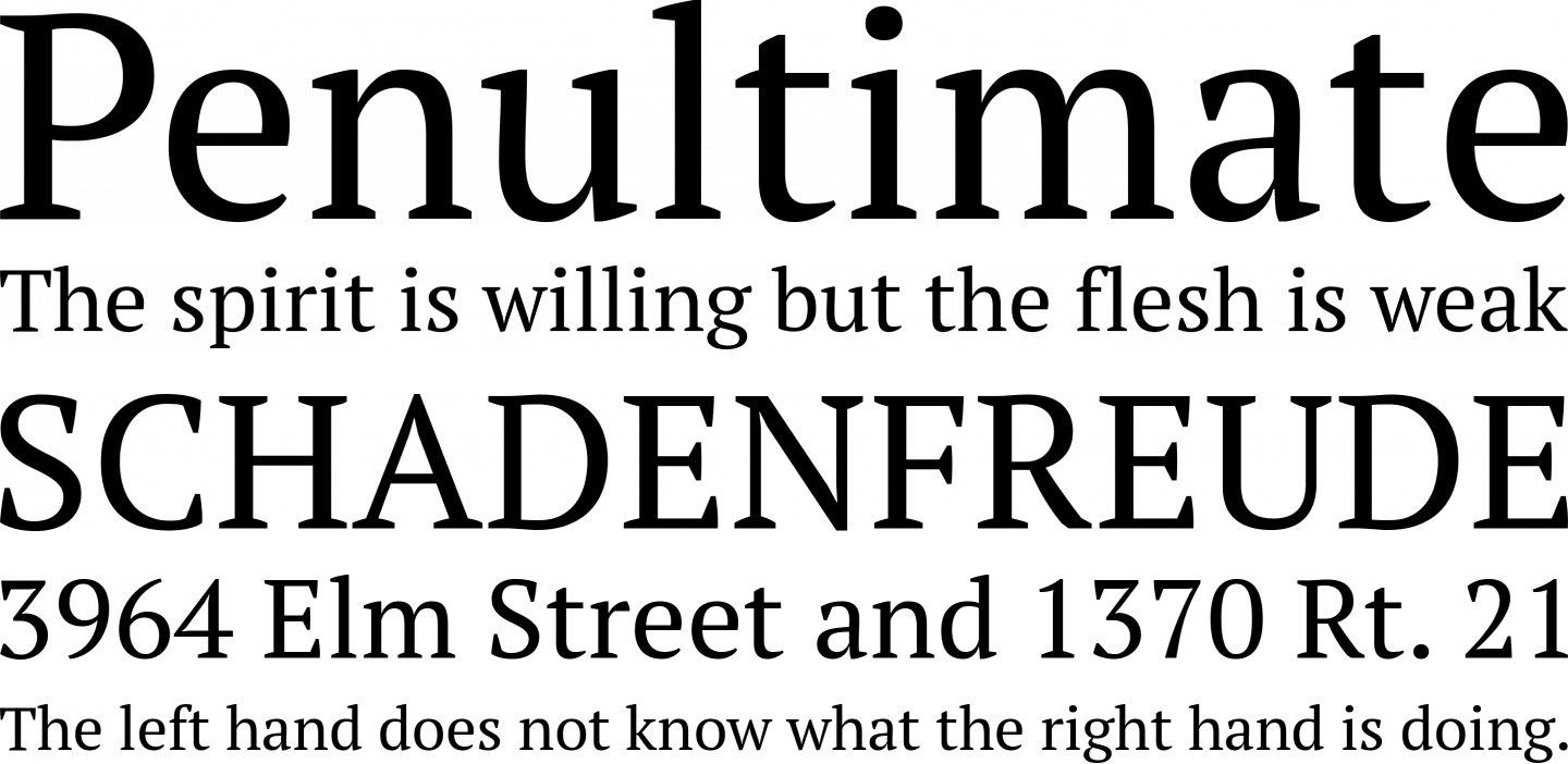
PT Serif
PT Serif is a transitional serif typeface with humanistic terminals. It is designed for use together with PT Sans, and is harmonized across metrics, proportions, weights, and design.

Berla
Brela is a serif typeface of Humanistic style designed exclusively for editorial design. Thanks to the generous height of X, it accomplishes great legibility at small sizes. At bigger sizes its rational features stand out, making this typeface perfect for headlines.

Calendas Plus
Calendas Plus is a scotch roman typeface designed by atipo foundry. Calendas contains alternative styles and figures, as well as discretionary ligatures.

New York
New York was designed by Susan Kare in 1984 for the original mackintosh computer. With the announcement of ios 13 Apple updated New York for the modern and is offering it for free.

Volkorn
Vollkorn is a family of twelve weights in both regular and italic. Designed by German designer Friedrick Althausen.

Lora
Lora is a well-balanced contemporary serif with roots in calligraphy. It is a text typeface with moderate contrast well suited for body text.

Spectral
Spectral is a new and versatile serif face available in seven weights of roman and italic, with small caps. Spectral offers an efficient, beautiful design that’s intended primarily for text-rich, screen-first environments and long-form reading.
Serif Typefaces — Slab Serif

Arkibal Serif
Arkibal Serif is a companion typeface for Arkibal Sans. Arkibal Serif is a slab serif designed by Jan-Christian Bruun.

Bitter
Bitter is a slab serif typeface designed for reading on screens. Bitter was designed by Sol Matas through the type collective Huerta Tipográfica.
Sans Serif — Grotesque

Chivo
Chivo (‘goat’ in Spanish) is the first Omnibus-Type neo-grotesque, typeface family. It has 7 weight variants, plus matching italics. Its solidness and balanced strokes give Chivo both elegance and practicality. Chivo Regular works perfectly in long-reading texts, while Chivo Black is ideal for headlines, banners, and highlights. Developed by Héctor Gatti, this is an indispensable ally for any designer.
Aileron
Aileron is a neo-grotesque sans-serif created by Sora Sagano, of Tipotype. Aileron is available in 16 weights from ultralight to black.

Sporting Grotesque
Sporting Grotesque is a contemporary Grotesque Sans Serif typeface designed by Lucas Le Bihan, and adapted for Greek by George Triantafyllakos.

Arkibal Sans
Arkibal is inspired by old documents and store signs from Jan-Christian Bruun’s great-grandfather's old gold list factory from 1838. He delivered hits for many artists of that time, and various museums in Copenhagen. Arkibal is a grotesk sans serif typeface.

Radio Grotesk
Radio Grotesk brings contemporary characteristics to a classic typestyle. The three weights allow Radio Grotesk to be effortlessly adaptable to any project. Free for personal use.

Anodina
Anodina, created by Stefano Giliberti, is a font family with human features but symmetric in it’s soul. It includes 5 weights from Extra Light to Extra Bold. This font family is great for logo design, posters, basic text, headlines, and much more.

Space Grotesk
Space TIC, a three weight proportional version of the original Space Mono, which proved to be a solid display typeface. Space TIC was later complemented with a single weight text version (Space TIC Text), which created a baseline for Space Grotesk.

Fivo Sans
Fivo Sans is a free neo-grotesque inspired by the International Typographic Style. Its voice is strong and smooth. Fivo was designed to be neutral, clean, simple and Swiss enough. That makes it perfectly suitable for texts and headlines, logotypes and posters.

Noway
Noway font-family is set up in 10 weights: thin, light, regular, medium, bold & italics and a pack of 159 icons for every possible user. It is ideally suited for branding, packaging, editorial, wayfinding and signage as well as web and screen design.
Sans Serif — Geometric

Roboto
Roboto is mostly geometric sans on Google fonts. It has a mechanical skeleton and the forms are largely geometric. At the same time, the font features friendly and open curves. While some grotesks distort their letterforms to force a rigid rhythm, Roboto doesn’t compromise, allowing letters to be settled into their natural width. This makes for a more natural reading rhythm more commonly found in humanist and serif types.

Poppins
Poppins is a geometric sans typeface. With support for the Devanagari and Latin writing systems, it is an internationalist take on the genre. Many of the Latin glyphs (such as the ampersand) are more constructed and rationalist than is typical.

Signika
Signika is a sans-serif with a gentle character, developed for wayfinding, signage, and other media where clarity of information is required. It has a low contrast and tall x-height to improve readability of texts in small sizes as well as in large distances from the reader. Being a typical signage typeface it is inspired by typefaces such as Ronnia, Meta, and Tahoma.

Archia
Archia is a sans serif typeface based on geometric shapes and “tech” approach. The result is a modern and unorthodox font family that is ideally suited for logotypes, branding, editorial design as well as web and screen design. Archia is available in six weights: thin, light, regular, medium, semibold and bold.
More About Typography


The typographer John Hudson puts it best variable fonts are “a single font file that behaves like multiple fonts”