Digitizing a Typeface: Part 1
There are a few basic rules and tips to understand before beginning to digitize a typeface. This guide along with my IGTV video will help improve your digitizations skills and ensure the process of digitizing your typeface drawings is easier. If you want to know more about sketching your typeface for digitization check out my previous article. While this tutorial can be used with any vector editing tool (ie. adobe illustrator) it specifically is geared toward typeface design software programs (GlypsApp, Robofont, FontLab) because they have features, I will be talking about, that are unique to typeface design that other programs don’t have. You are welcome to use Adobe Illustrator to test out the different principles that I am talking about, but if you want to produce a finalized font to be used you will need a typeface design program.
I have used Each of the three different softwares, and they each have their own pros and cons. If you want to know more about the unique features of each of them check out each of their respective websites. Let me know if this is something you want me to write about deeper and I can write an article breaking down the different programs. Also, each of their websites has its own tutorials detailing how to use their products, I particularly like the tutorials from GlyphsApp they are easy to follow and approachable (which isn’t always a guarantee). This article will cover some things that are not detailed in the tutorials but are equally important to know when beginning to design a typeface.
Optical Illusions
Image One: Horizontal lines always appear thicker than vertical ones even when they are the same width. This optical illusion needs to be considered when digitizing type.
Different shapes do not appear the same size even when they are. In typeface design the most common example of this is that horizontal lines always appear thicker than vertical ones (see Image One to the right). If you would like the horizontal and vertical lines to appear the same width horizontal lines will need to have their width decreased, or vertical lines need to be increased.
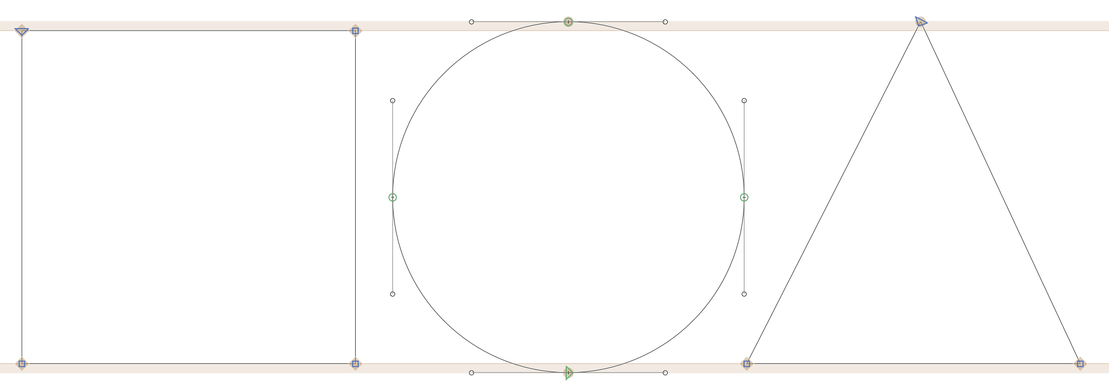
The second optical illusion that needs consideration is that a square will always appear larger than a circle or a triangle, of the same size. This is because of the empty space around circles and triangles, this negative space makes the object appear smaller than it actually is. This optical illusion will come into play again when we address spacing. To compensate for the optical illusion caused by these shapes “overshoot” needs to be included on rounded shapes. Overshoot is a typography term for increasing the size of your object slightly in order to make it appear at the same height as other objects.
Image Two: Squares, Circles and Triangles will look to be the same size if overshoot is not included. GlyphsApp provides visual guides for where to place the overshoot.
Overshoot on rounded shapes is one of the most common adjustments in the latin alphabet. Half of the letters in the lowercase require some sort of overshoot. Typeface design software programs include guides that compensate for this. In Image Two there are orange bars above each of the lines (baseline, x-height, etc.), each of the orange bars provides a reference for your overshoot. You can adjust these lines dependent on your specific needs, as typefaces meant for different sizes and uses have different needs.
More exact drawing tools
The pen tool in type design software is more exact than the pen tool in other software programs. Typeface design software differentiates between different types of bezier points, and also has a more detailed and exact grid. This allows for more purposeful point placement. The first type of bezier point are two independent sides. So when one side of the point is adjusted in angle or the bezier handles the other side remains unaffected. The corner points of a square are the first type of point, each side of the point are independent of the other. Whereas, the second type of point is a curved where both points are affected by the other. If you think about a letter o when you move the handle on one point and how it affects the curve on the other side, this is the second type of point. This is a complicated idea to explain and can even be confusing in practice, if you want to reach more check out this tutorial.
The standard grid in typography apps is broken down to 1000 parts as a standard. This allows for much more precise and exact placement of points. The ability to be exact when placing bezier points is important as one or two units can make a difference when designing typography. When zoomed in the grids reveal themselves so exact placement can be achieved.
Path direction in typeface design programs is important, as the direction of two overlapping paths indicates if a shape should be filled in or cut out. The pathfinder tool doesn’t exist in typeface so in order to create a counter the directions of two paths need to be opposite. For example the letter “o” the outside path will go clockwise direction and the path for the inside counter will go the counter clockwise direction, causing the counter to “reverse” out be filled in.
One unique feature of typeface design programs that can be confusing to first-time type designers coming from illustrator, is that the paths do not automatically fill in. Instead in order to view the letter filled in you have to press a key (such as the spacebar in GlyphsApp). Personally, I prefer drawing without having the object fill in, I have had issues where when I am drawing a path and illustrator is filling it in so I can’t see what I am doing. By not automatically filling in the path it provides a more exact view of the drawing. The overarching goal of typeface design software is to be as exact as possible because typography is more refined and exact than drawings.
Drawing Best Practices
Like most vector drawing programs the goal of drawing typography is to be efficient with your point placement. A good rule of thumb is that vector points should correspond to cardinal directions (north, south, east, and west). This helps create cleaner paths as well as curves, if the points are on cardinal directions you can assure that the curves are more exact than if they were slanted. In all software programs, including illustrator, by holding the shift key while placing points and bezier handles it will lock them to the cardinal directions, as well as on 90 degree angles.
Image Three: Bezier Points should go on the cardinal directions and be use sparingly. Two paths going opposite directions will create an open counter. This is indicated by the arrows at the bottom of each circle going different directions.
Another key to drawing good paths is that fewer points is better. Less points simplifies the font file, as well as decreases the possibility of errors and problems with the fonts. If you have ever seen a curve that doesn’t look perfectly smooth it could be because there were too many points and by decreasing the number of points it could lead to a smoother curve. On the other side of this too few points can also be a detriment to your designs. Not having enough points can cause you to try and compensate by making your bezier curves less exact than is idea. Bezier curves are an art that requires lots of practice and frustration unfortunately. There is a game online that allows you to practice in a low pressure situation that can be more fun than stressing about them on a project.
This guide provides some insights into basics that you need to know when beginning to sketch out a typeface. There will be future parts to this guide that dive deeper into other parts of digitizing a typeface. If there is anything specific that you would like me to cover please let me know. While you can read everything there is to know about digitizing typefaces there is no substitute for exploring on your own. You can’t do any damage by opening up a blank file in any font design application and playing around for a bit. This will show you how things work and allow you to explore without the risk of messing anything up. So I recommend before you start digitizing your typeface go and play for a bit so you are more familiar with the topics I talked about before beginning to digitize your drawing.


The typographer John Hudson puts it best variable fonts are “a single font file that behaves like multiple fonts”
In a previous article, I highlight great free fonts available for download. Unfortunately, not all of the fonts can be used for commercial projects. So here is a list of the best free fonts you can download that are free for all use case scenarios (print, digital, commercial, etc.)
Have you ever wanted to revive an old typeface, or practice your typeface design skills? Learn steps and tricks to creating your own font revival.