
Website Optimization
Website Optimization
Problem
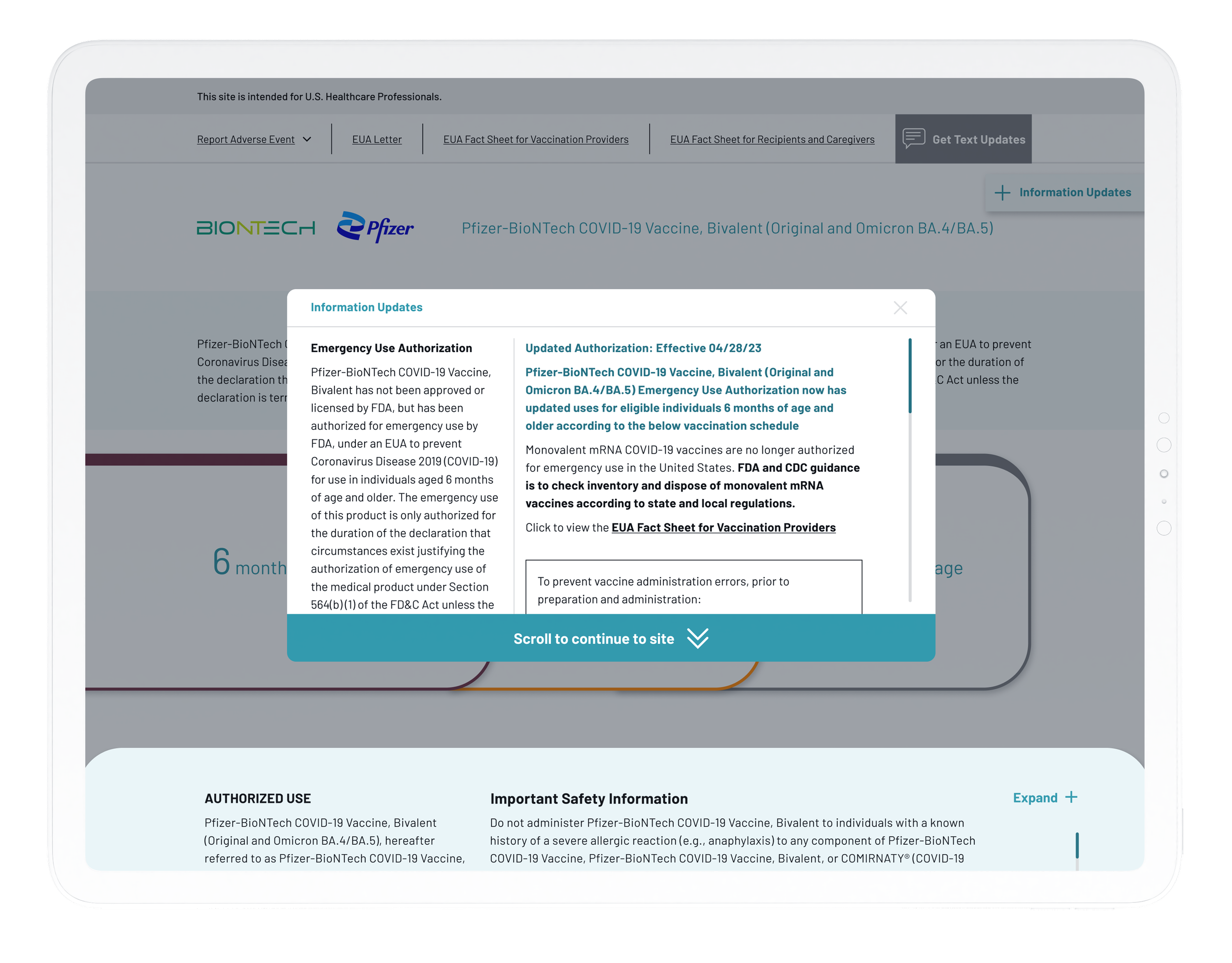
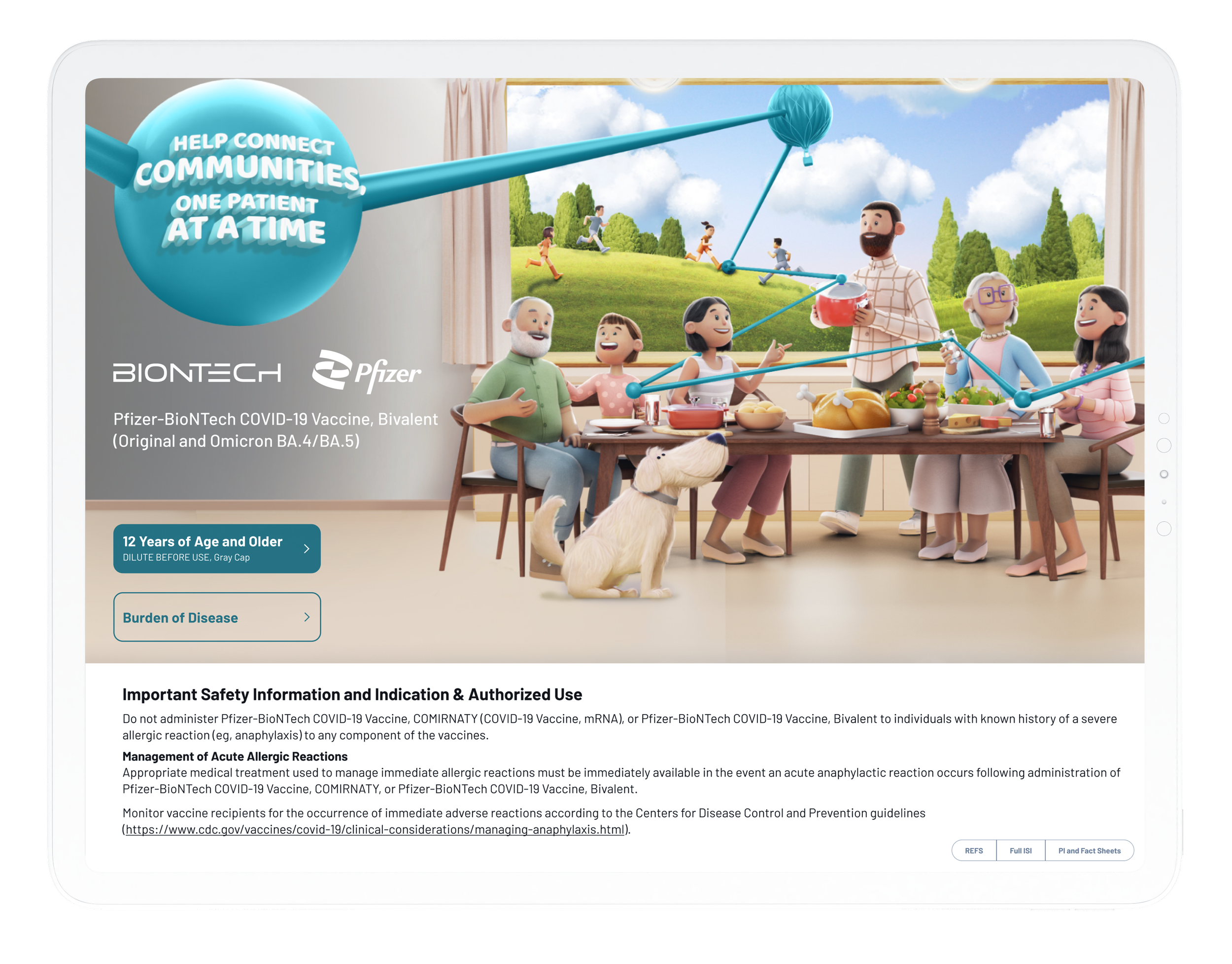
The Pfizer COVID-19 website featured a popup on load to notify users of FDA updates regarding the drug, which unfortunately led to a user-unfriendly experience and a 90% bounce rate across the site. Our objective was to refine the popup experience to significantly reduce the website's bounce rate.
GOAL
Our aim was to lower the website's bounce rate by enhancing the user experience with a more engaging and less intrusive design for the required popup notification.
To enhance the user experience on the Pfizer COVID-19 website, we embarked on a comprehensive redesign of the mandatory popup that informed visitors of the latest vaccine updates. Initially, this popup was a recurring interruption, appearing every time a user visited the site and requiring them to scroll to the bottom to close it. Our approach to redesign involved not just reevaluating the popup's operational rules but also implementing significant UX/UI changes to further improve usability.
Collaborating with the legal team, we managed to introduce a change log for the popup, which was a critical step in enhancing user interaction. We modified the popup to appear only once during a user's initial visit. After closing it, the popup would remain hidden unless there was new information, the user opted to reopen it, or 90 days had passed since their last interaction. This reduction in frequency, coupled with our UX/UI enhancements, aimed to make the popup less intrusive and more user-friendly, contributing to a more seamless and engaging website experience.
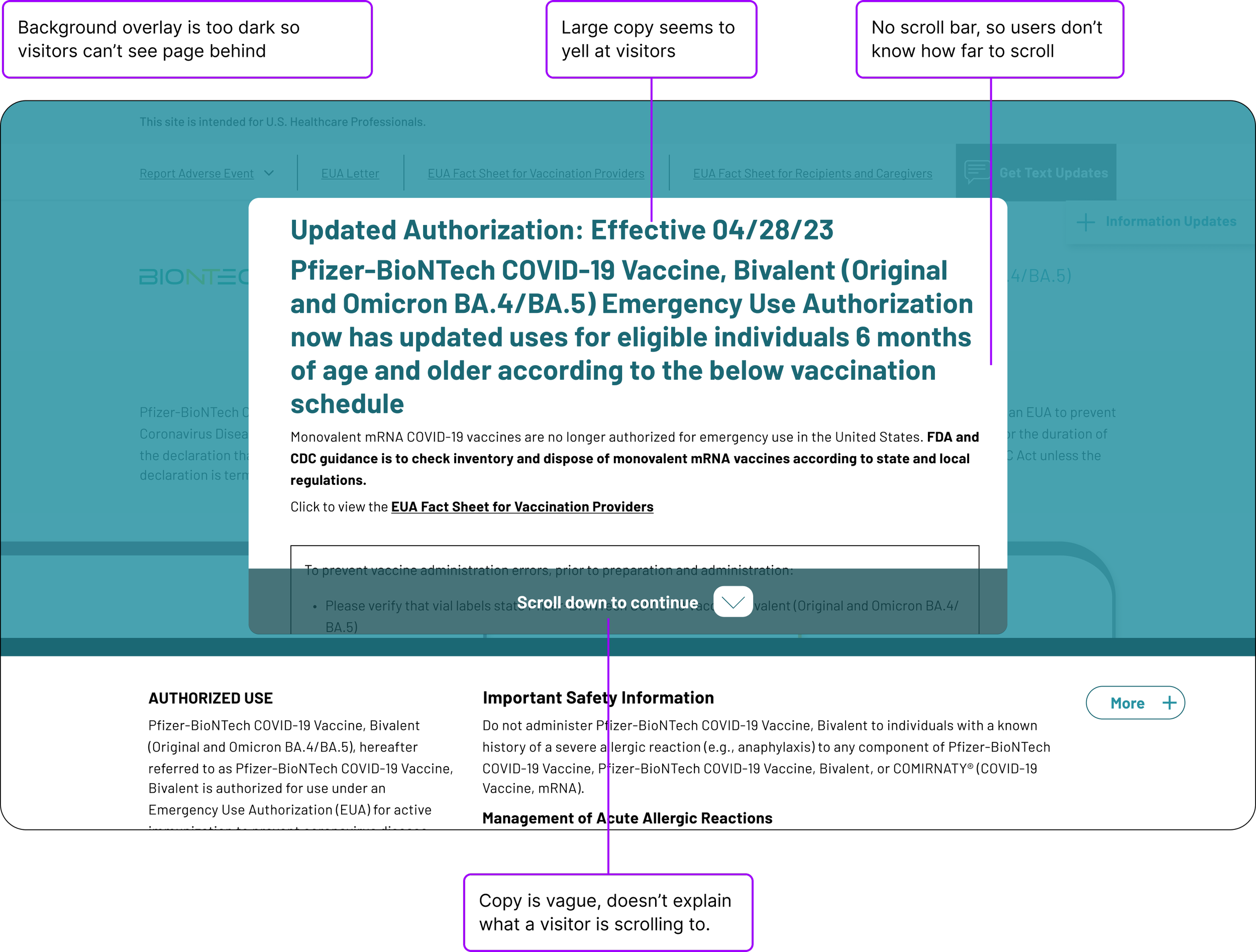
Upon arriving at the website, visitors were immediately met with a large popup featuring assertive copy, which, combined with an overly dark overlay, obscured the existence of additional content behind it, leaving visitors unaware of the website's full offerings. The popup's descriptive text failed to clarify the purpose or destination of the user's scrolling, lacking visual cues or indications that it was, in fact, a popup—factors we believed contributed significantly to the site's high bounce rate.
However, a useful feature of this design was the 'scroll to the bottom' button, which, when clicked, anchor-linked users directly to the popup's closure point. Unfortunately, this function was underutilized due to the button's absence of hover states, leaving users unaware of its interactivity and further impeding site engagement.
Upon reaching the bottom of the popup, visitors were presented with a mandatory agreement statement, accompanied by a "Continue" button that lacked any indication of the user's next destination. Compounding the confusion, the popup's design flaw caused it to fall behind the bottom bar when scrolled all the way down. This created a perplexing situation where it appeared as though users hadn't reached the bottom of the box, suggesting a technical glitch that prevented further scrolling, rather than a deliberate design choice, further complicating the user experience.
UPDATES
In revising the user popup, our primary objective was to simplify the process, ensuring users could navigate through the popup swiftly and access the information they sought with minimal friction.
When redesigning the UI of the popup there were some crucial visual queues that we added to help users understand that there was content beyond the popup. We started by refining the font sizes so the text wasn’t yelling at users when they first reached the website. We also broke the content up into two columns. This allowed for a higher archy as well as it decreased the length of the scroll within the popup. We also added a headline to help users understand what they were looking at. Indicators like a scroll bar, close icon alsog with revised copy that provided better direction improved the usability of the website.
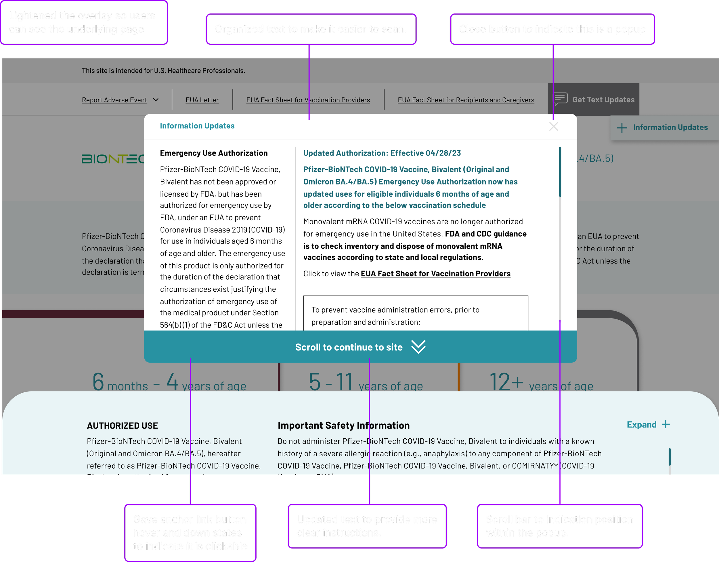
In the process of redesigning the popup's UI, we incorporated several key visual cues to clarify that additional content was available beyond the popup. First, we moderated the font sizes to ensure the initial message was welcoming rather than overwhelming. By organizing the content into two columns, we not only established a clearer hierarchy but also significantly reduced the scroll length within the popup. Adding a headline further guided users by succinctly explaining the popup's purpose. Introducing user-friendly elements such as a visible scroll bar and a close icon, along with revised copy that offered clearer instructions, greatly enhanced the website's usability, making it easier for users to navigate and understand.
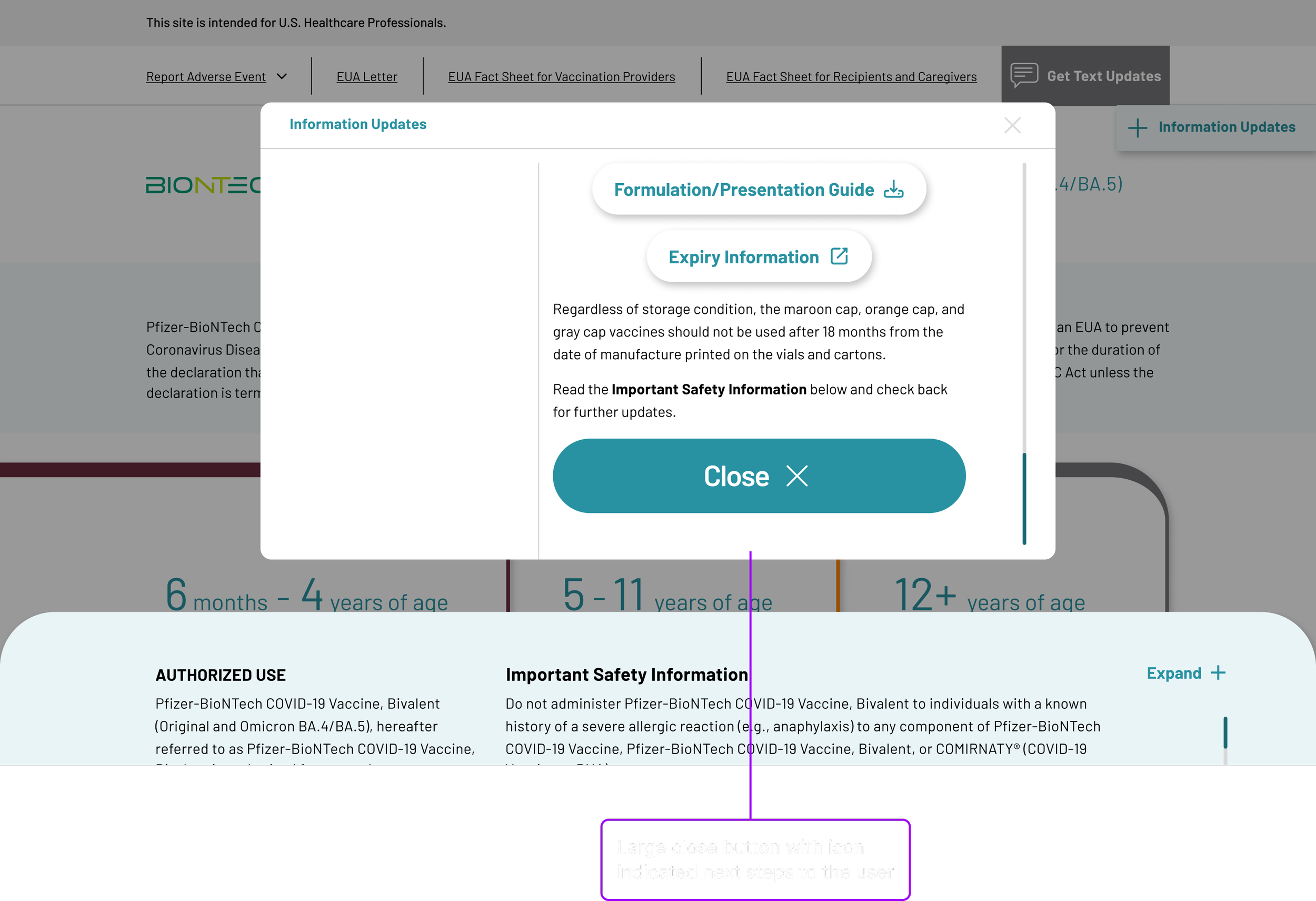
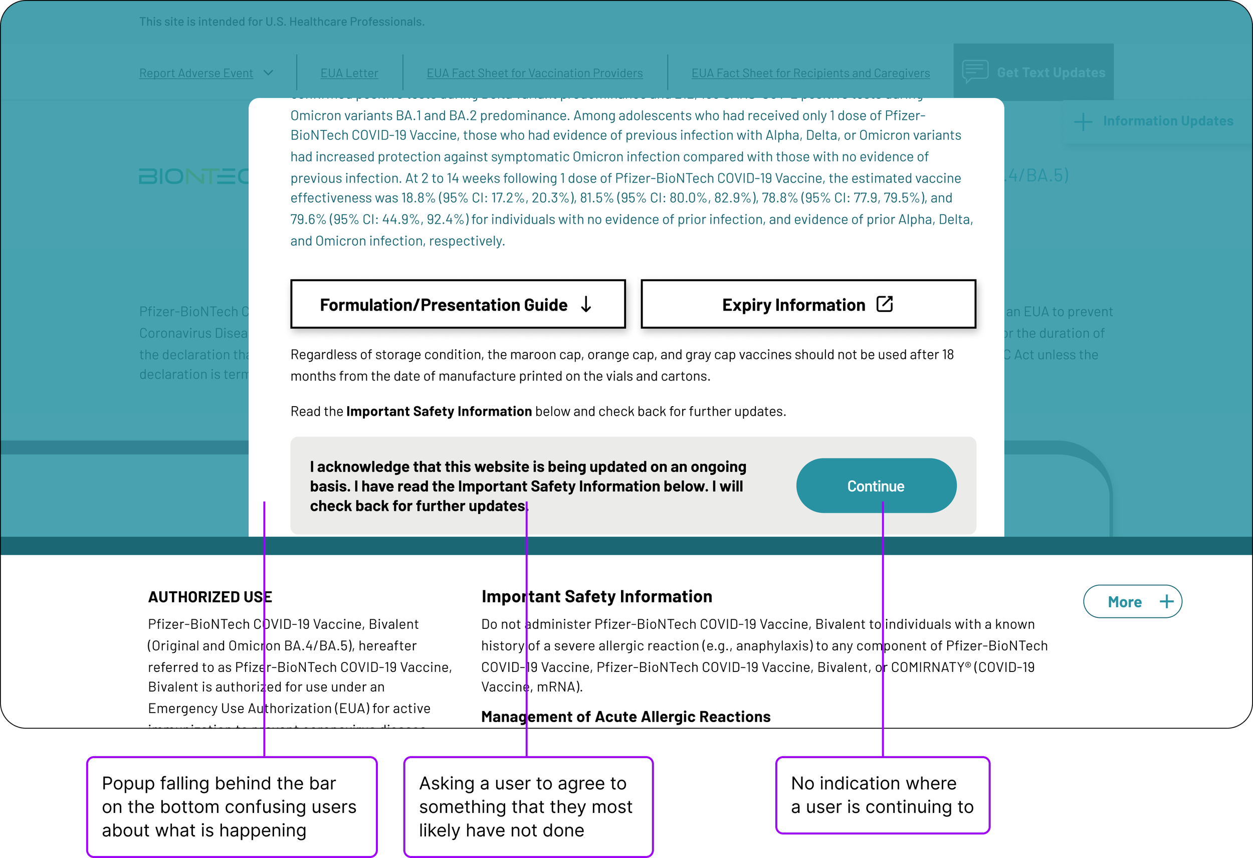
Upon scrolling to the bottom of the popup, users were presented with a large, straightforward option to close the popup, granting them easy access to the full website.
While greeting users with a large popup upon arrival is far from ideal, through strategic UX and UI enhancements, we managed to significantly streamline the experience. These improvements not only made the process less cumbersome but also greatly enhanced usability and successfully reduced the website's bounce rate. This project underscored the importance of thoughtful design and user-centric strategies in overcoming initial user engagement hurdles, demonstrating that even mandatory information disclosures can be integrated seamlessly into the user journey, ultimately leading to a more welcoming and efficient digital environment.
RESULTS
The redesign of the popup led to a ~40% decrease in the website's bounce rate. This improvement was achieved by simplifying the user experience and introducing visual cues that previously were absent, guiding users more effectively through the site.
See other projects for the Pfizer COVID-19 brand.
See how we improved the accessibility of the Pfizer COVID-19 iPad application.

See how we rebuilt the entire COVID-19 website in 3 days.