

iDetail Redesign
iDetail Redesign
Problem
The Pfizer COVID-19 sales aid initially faced challenges due to its content-dense nature. Without a clear UX strategy, standardized visuals, and an intuitive user flow, it was not only difficult to locate specific information but also challenging to present this information effectively to healthcare providers.
OVERVIEW
Navigating Pfizer's COVID-19 app proved to be a complex and inconsistent experience, posing challenges for users in easily finding the information they needed.
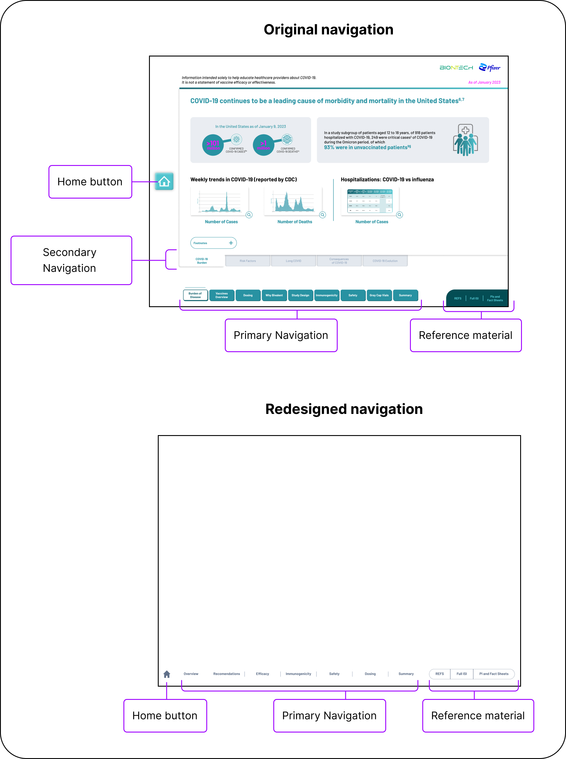
In the initial phase, we undertook a thorough audit of the existing interactive sales aid. We encountered a challenging scenario: an array of buttons, each vying for attention, which often left users puzzled about their next steps. This complexity was exacerbated by the integration with Veeva, the underlying software platform, which introduced its own set of buttons, leading to non-functional areas and an additional layer of navigation complexity.
Further, legal required that the sales aid was divided into three distinct sections, each serving a unique purpose: the first, an unbranded segment focusing on the disease; the second, dedicated to the FDA-approved drug; and the third, highlighting the conditonally approved drug. This tripartite structure, while necessary, added layers to the user journey, making it more intricate than desired.

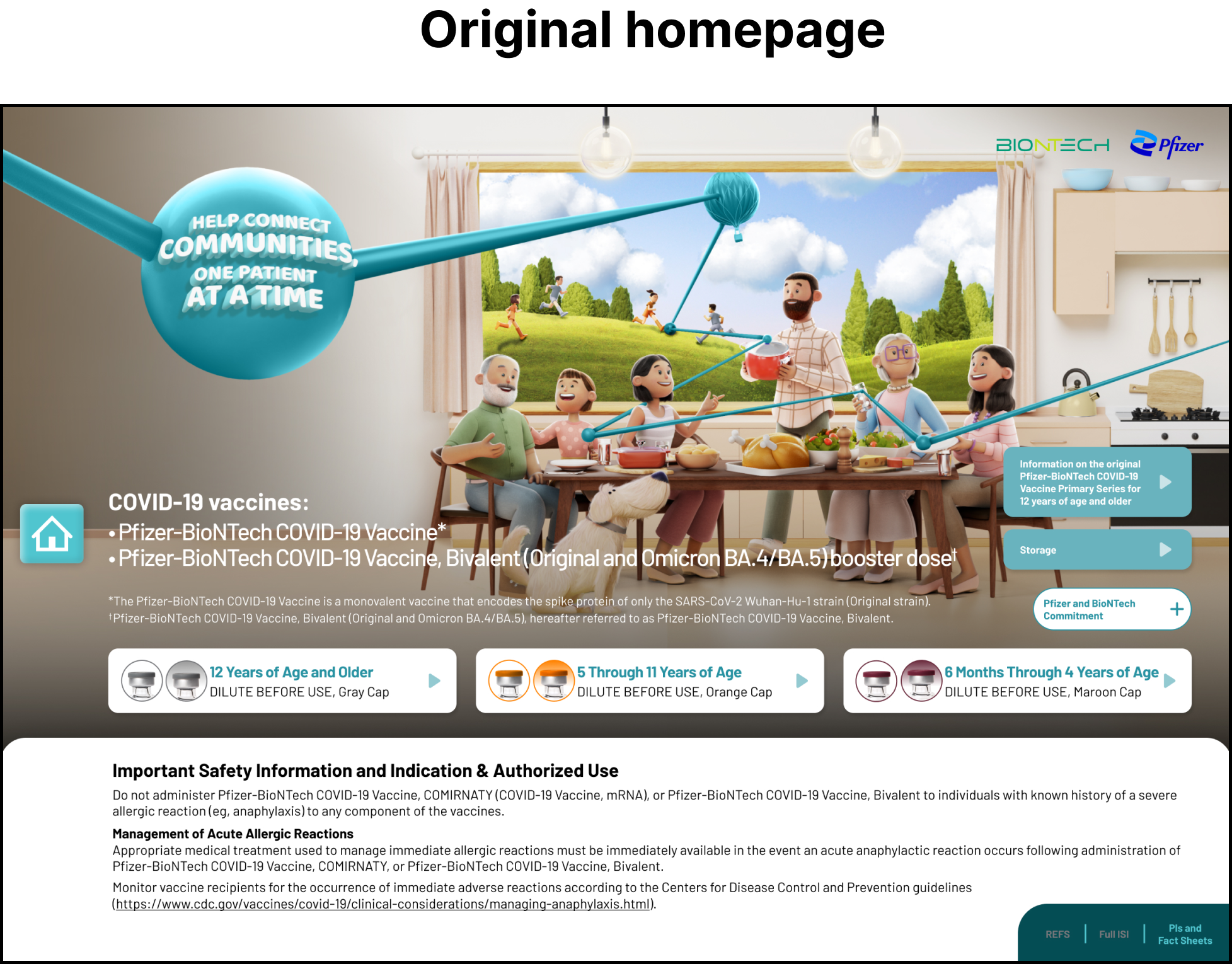
The home screen's clutter proved to be a major hurdle, overshadowing the campaign's headlines and complicating overall communication. Initially, users were overwhelmed by an array of equally prominent buttons, making it challenging for them to discern their next move.

Popups had been employed to relegate less critical content, aiming to streamline the user experience. However, the inconsistent size and placement of these popups inadvertently complicated the process for users to dismiss them, leading to not only a challenging user experience but also visual inconsistencies throughout the application

In my comprehensive audit of the button styles, I discovered a diverse mix of designs and a notable lack of consistency. The buttons lacked a clear hierarchy to indicate their importance. Additionally, in some cases, the distinction between selected and unselected states was so subtle that it was nearly impossible to discern whether a button had been activated.
BACK TO BASICS
Going back to the drawing board was essential. To enhance navigation and reduce content density, I recognized the need to start from the ground up, focusing on redesigning the fundamental elements of the interface.
I began by conducting a thorough audit of the user flow. This led us to a pivotal decision: splitting the app into two separate entities. One would concentrate on FDA-approved content, and the other on non-approved material. The distinction was clear-cut; these two content types simply didn't mesh well together. As the non-approved version received FDA approval, our plan was to seamlessly integrate the two sections back into a single app. This strategy not only simplified the app by removing an extra layer of navigation but also paved the way for future updates.
With the user flow more streamlined, I turned my attention to overhauling the main navigation. The original design scattered various buttons across the interface, causing confusion. My objective was to centralize all navigation elements at the bottom of the screen. This would make it easier and faster for users to locate the information they needed.

Our primary goal was to clarify each page and create a uniform layout for content, making it easier for users to quickly find the information they need. A pivotal part of this strategy involved reimagining popups as side-sliding trays. I developed two sizes of trays, small and large, to ensure flexibility while keeping a consistent design. This approach not only centralized content but also streamlined the closing process, greatly improving the speed and ease of user interaction.
Additionally, we refined the trays further by dividing them into two sections. The main section was dedicated to primary content like charts, graphics, and tables. The bottom section was reserved for necessary but less critical information, like footnotes. This separation allowed users to concentrate on the main content without being sidetracked by less important details.
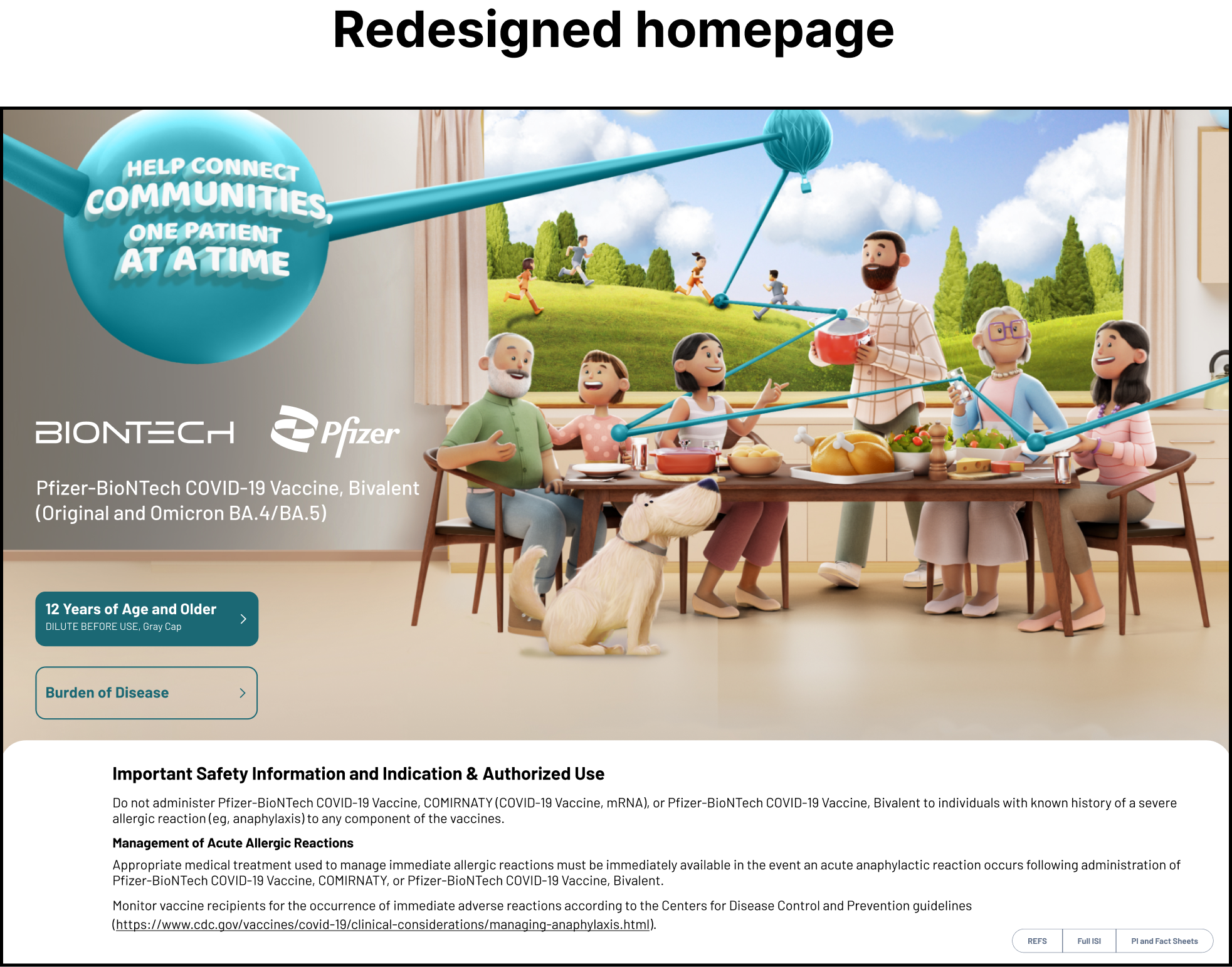
A perfect illustration of how these redesigned elements synergized to achieve our goal of a streamlined app is seen in the homepage. This redesign not only enhanced the user experience but also improved content comprehension. By integrating these elements, we significantly simplified the navigation experience, making it easier for users to find what they need, while effectively reducing clutter and complexity.
FINAL THOUGHTS
Through a comprehensive redesign focusing on simplifying navigation and standardizing content layout, we transformed the user experience of the app, making information more accessible and reducing clutter, particularly exemplified in the streamlined, user-friendly homepage.
See other projects for the Pfizer COVID-19 brand.

See how we rebuilt the entire COVID-19 website in 3 days using the design system.

Explore the creation of the Pfizer COVID-19 Design System that was used in this project.