Design System
Design System
Problem
When Pfizer was racing to develop the Comirnaty vaccine, every part of the brand, including digital platforms, had to move at the same breakneck speed. That's where I stepped in: I designed a comprehensive Design System for our digital content, making collaboration smoother and boosting our productivity big time.
PROBLEM
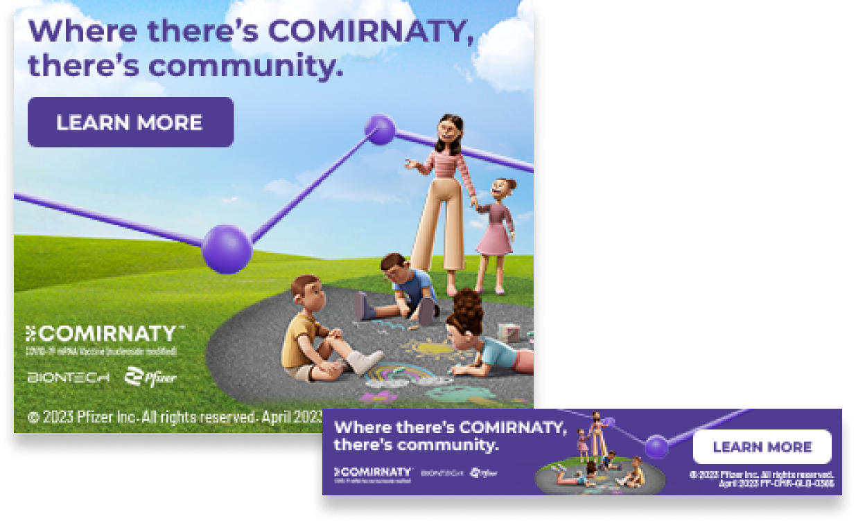
When Pfizer’s COVID branding was created, it was a super quick process. Meaning there was no design system in place, leaving us with pieces that were all designed independently.


GETTING STARTED
The initial phase was all about gathering and sorting the existing materials. I had to sift through hundreds of files across various software programs and organize them all in Figma for better clarity and accessibility.
We encountered a plethora of button styles, each with subtle variations. This diversity led to a lack of uniformity, posing challenges for users in swiftly recognizing buttons as clickable elements.

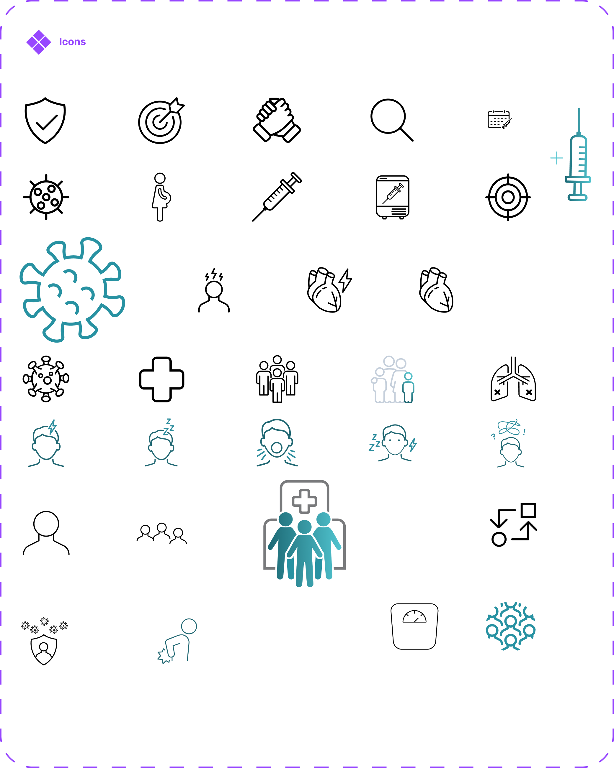
We faced an array of icon designs, varying in shape, color, gradient, and style. Notably, for the COVID virus alone, there were three different icons all intended to represent the same thing.

Similar to other elements, we encountered a diverse mix of text styles, including several duplicates that were all meant to be used in the same situations.

ATOMIC DESIGN
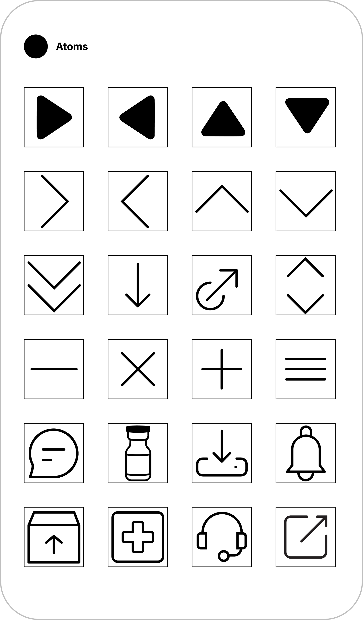
To maximize the design system's utility for both designers and developers, we structured it around atomic design principles and integrated design tokens for seamless collaboration.
While crafting the atomic elements for swift interchangeability, ensuring uniformity in icon sizes, and designing base elements like colors and buttons for rapid customization, I placed a significant emphasis on inclusivity and accessibility. From the ground up, our design system was focused on usability and accessibility, integrating WCAG (Web Content Accessibility Guidelines) standards to ensure that our digital products are accessible to all users, including those with disabilities. Utilizing Figma's advanced component tools, I developed versatile molecules that could be updated effortlessly. These foundational pieces were then used to construct organisms, such as the website's navigation. This approach ensured that our design system was not only efficient and flexible but also accessible and usable for everyone from its inception.


PUTTING IT IN ACTION
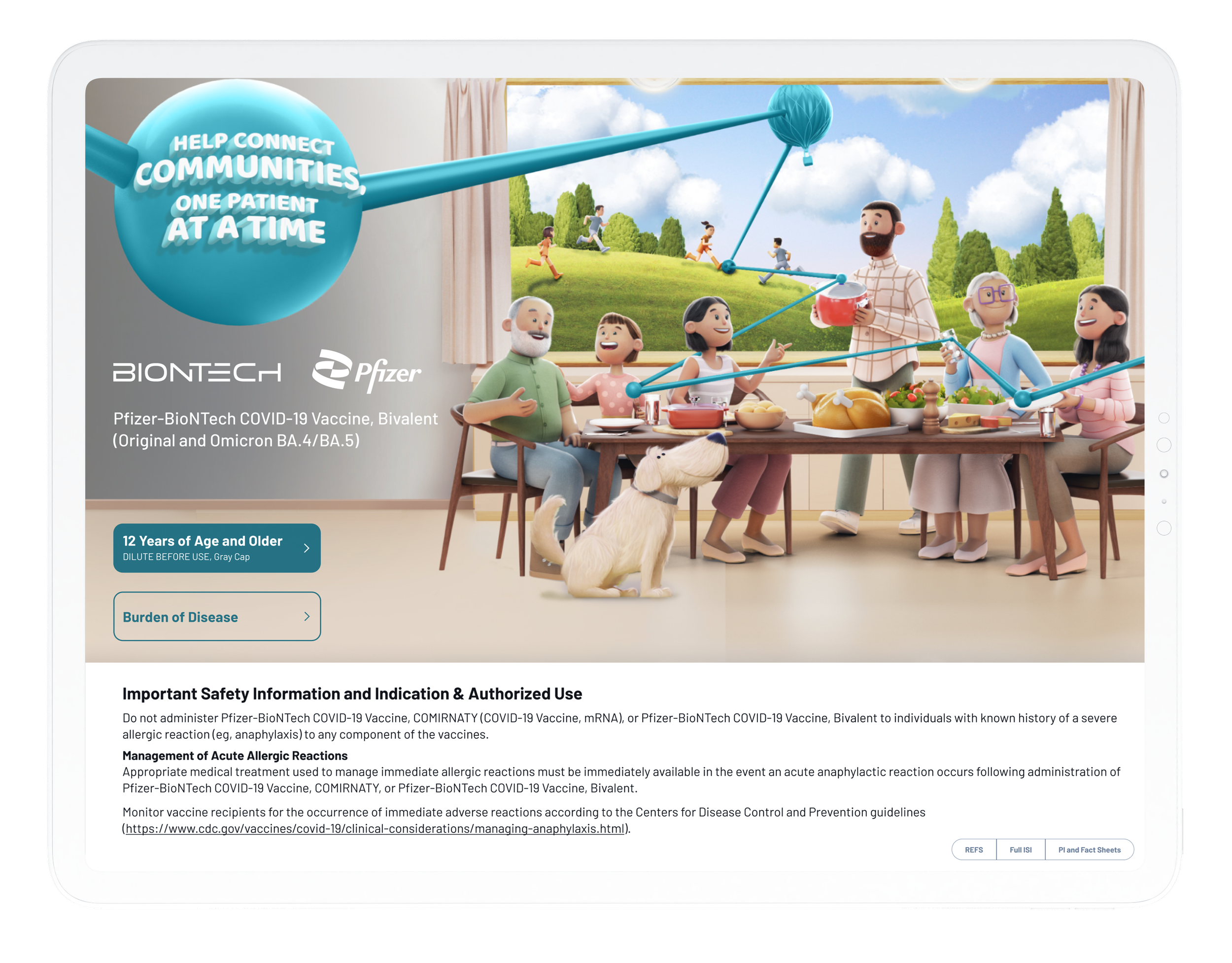
Developing a more robust design system enabled us to rapidly construct our website and iPad apps, ensuring both consistency and speed in our digital presence.
See other projects for the Pfizer COVID-19 brand.

See how we rebuilt the entire COVID-19 website in 3 days using the design system.

Explore how the design system was used to rebuild the iPad app for the COVID-19 Vaccine.

