Reflecting on Designing a Typeface: Robert III
This year I learned how to see. The classes, collection sessions, workshops, critiques, and work I have done for my Masters of Arts in Typeface Design (MATD), at the University of Reading, taught me how to look at, decipher, dissect, and critically analyze typography. The way I view and interact with typography has transformed through planning, designing, and revising a typeface. The numerous problems and learnings that I faced throughout the process of creating a typeface challenged the way I view and examine the work I do. Analyzing typography is an essential skill for a typeface designer, and it allows a designer to interact with and create typography and commentary that is relevant to the typographic and broader design industry. Critical analysis sets a typeface designer apart from someone with merely a computer and software.
Starting a Typeface
A typeface for a demanding usage
Figure 1. Example of Pharmaceutical advertising publication.
Print Brochure. 9in x 12in. Esbriet, Genentech. 2017
Before studying at the University of Reading, I worked as an Art Director for a pharmaceutical advertising agency. This specific subset of advertising demands typefaces for a wide variety of situations, such as footnotes in 6pt font, conventions, and billboards with type at sizes larger than 1000pt, and typefaces with a wide range of weights, and a condensed face (Figure 1). The broad range of sizes and uses can stretch a typeface to the limit of its usefulness, and designers are often forced to use multiple typefaces together to achieve the desired effect.
When starting the MATD, I learned about variable fonts. The primary usage of variable fonts is to save file storage and space, allowing faster load times for web. The small file sizes of variable fonts are ideal for pharmaceutical advertising because drug representatives use iPads and websites for promotional materials, and a variable font would provide designers more choice without the constraints of file embedding. While file size is important, I was more interested in using variable fonts as a way that designers can exert more control over their typography. Variable fonts afford designers greater freedom by providing a sliding scale, literally, of options instead of preset choices (i.e., Light, Medium, Bold). For example, when a designer needs a little more space, they can adjust how condensed a typeface is to fit the space they have instead of having to go with a preset amount.
While the idea for this typeface was inspired by my work with pharmaceutical companies, the design of my typeface is intended for all types of advertising and marketing as they share many of the same goals and problems as pharmaceutical advertising. The advertising market for most products is typically in the United States (U.S.) and Europe. I decided that a complementary non-Latin typeface would be Greek, which would allow advertising agencies to use the same typeface for all of their promotional materials across the U.S. and Europe.
Planning a variable font
Figure 2. Sketch of different variables when mapping out
my variable font.
After defining the problem, my first challenge was planning the family. Approaching the variable font was initially tricky because I have never created one before, so I was unfamiliar with the design space as well as the mapping process. I was able to better understand the relationships between various weights and shapes—Roman, Light, Bold, Italic, condensed— of my typeface by mapping out the different features and the extremes between their relationships (Figure 2). Even with this exercise, I didn’t fully grasp the relationships of a variable font until I began designing the different axes of my typeface.
Figure 3. Redesign of function of variable font.
After designing the different masters, I realized that I needed to redesign the sketch of the design space in a way that could easily communicate how my typeface works. My increased experience with variable fonts allowed me to understand the multidimensionality of variable fonts and how each master relates to one another better than when I was first mapping out my typeface. Since I had a better grasp of variable fonts and how they operate, I was able to illustrate better how my typeface works (Figure 3).
Inspiration and initial designs
Part of the planning required finding inspiration as well as deciding what style of typeface I wanted to create. I was immediately drawn to slab serif typefaces as they are authoritative, bold, and currently popular in advertising. I decided to look for slab serif typefaces that work well with lots of text, see what they do well and what I can improve. My primary references were Lyon, Guardian Egyptian, and Swift (Figure 4). Each of these typefaces has a clean, bold simplicity to them, and they work well in text-heavy documents.
The Design Process
Creating test documents to visualize a typeface
The first challenge I encountered when designing my typeface was setting up a useful test document to evaluate specific parts of my typeface objectively. I quickly learned that setting up a test document means that the layout and text need to change for each feature I am testing and that a test document isn’t just text on a page.
One particular instance where a properly designed test document was crucial was when I was working on the spacing of my typeface. To create a spacing test document, I had to think about how to identify proper spacing. A well-spaced typeface is one that is consistent and even, creating a clear visual pattern. I created a test document where I compared base letters (n, m, h, o, a, u, e, i, c, s) to set a standard spacing. Next, I tested all the non-kerning letters, and finally, all the letters in my typeface (Figure 5). This document allows me to see problems within my spacing quickly, and how adjustments to my non-kerning characters can affect my whole typeface.
Figure 5. Spacing test document. Column 1: base characters. Column 2: non-kerning characters. Column 3: all characters.
Training my eyes to see even spacing
The spacing of a typeface is as important, if not more, than the design of the individual letters. The spacing of a typeface can be the difference between a great typeface and an OK typeface. Everyone has an unintentional concept of space when they write by hand, and look at correct spacing when they read. I took my understanding of space a step further when studying visual communication, and typography, and yet I never truly understood how to space until I began spacing my typeface. Achieving an even texture was exceedingly more difficult than I thought it would be. Initially, I added too much space overall and uneven space between most of the letters.
One way I overcame uneven spacing was analyzing “well spaced” typefaces like Minion Pro. Dissecting other typefaces allowed me to see different letter combination relationships. I continued this exercise through the entire design process because as I learned, spacing is a process that develops at the same time as your shapes. Another exercise I used was stripping the spacing out of Minion Pro and trying to space the letters again. I learned that I naturally add too much space (Figure 6). By learning that I instinctively add too much space, I was able to evaluate my typeface better. As I continue to develop my typeface after completing my MATD spacing is something that I will continue to refine.
Figure 6. Practicing spacing by re-spacing Minion Pro. Cyan: my re-spacing, Magenta: original spacing
Drawing expressive curves
When I was first digitizing letters, they were dull, rigid, and lacked personality. While it was nice to know I could create a “boring” typeface that would work on a fundamental level; I needed to push my design to something more original. Designing Greek helped teach me how to create more expressive curves with life and modulation closer to the pen.
Greek type is rounder and more dynamic than Latin. The dynamism of Greek helped me reevaluate the way I look at Latin letters. I became braver with curves, and I applied the dynamism that I learned when designing Greek into my Latin. When I was researching typefaces that had the movement that I was looking for, I came to Zenon by Riccardo Olocco (Figure 7), which has the expressiveness and simplicity that I was looking to add to my Latin.
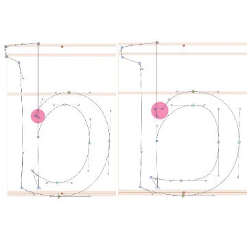
Figure 8. b: Stroke modulation influenced by my Greek Script. b: subtle curves to the straight lines.
Adding more movement into the Latin, which has a more powerful vertical stress, helped harmonize the script with Greek, a more fluid script. Moreover, adding subtle curves to the straight lines in Latin also helped the harmonization with Greek (Figure 8). Another critical issue when harmonizing Greek and Latin was that the Greek appeared lighter than the Latin, even when they were the same wights. Adding optical weight to Greek, allowed the two scripts to appear to be the same weight. The Greek exemplified how round shapes can appear lighter than more squared off letters.
Figure 9. Inconsistencies with my Greek lowercase delta.
It was evident when designing Greek that I had difficulties with consistency across styles. My consistency problems were visible in the modulation of the stroke across my different weights of Greek. I had issues ensuring the stroke width was in a consistent place across some of my characters, particularly the lowercase delta (Figure 9). One of the primary reasons for this was because I can’t read Greek, and lack experience analyzing it. So I didn’t know where and how to add weight. My lack of knowledge about Greek letters pushed me to look more in detail at well designed Greek typefaces, like Arno Pro, and evaluate my own to ensure that I add weight consistently
Where do I add weight and contrast
Figure 10. Top: original Bold that was too wide. Bottom: revised Bold.
My assumption when starting to design the Light and Bold styles was that the light was going to be more difficult, the opposite turned out to be true. The Bold was more difficult. The challenges of creating a Bold lie in where to add the weight, the level of contrast, and how wide to make the character. I wanted to try and preserve the large counters as that was one of the main characteristics of my Roman, but this caused me to make a Bold that was too wide. I had to revise my Bold and strike a balance between open counters and letter width (Figure 10).
Making letters more legible at smaller sizes
Figure 11. Top: inconsistent ink-traps applied.
Bottom: ink-traps at every joint.
In pharmaceutical design, there are lots of footnotes and references in small type (less than 9pt). Therefore, it is advantageous to have typography that is explicitly designed to be legible at small sizes. A Micro-sized family was one of the features that I wanted to include in my typeface. I began to explore different ways to make letters more legible at smaller sizes. The traditional way of increasing legibility is to add ink traps. Initially, I put ink traps in a few letters and realized that I was inconsistent with the application. By adding ink traps to all of the joints, the legibility increased significantly by decreasing the dark spots that occur at the joints (Figure 11).
Figure 12. Left: Roman letter with smaller counter.
Right: Micro-Size with larger counter.
To increase the legibility, even more, I increased the character width and made the counters more square, to open them (Figure 12). The increased counter did make it necessary to increase the spacing for the Micro-size. Regular spacing is too small for Micro-Sizing because the increased width and counters require equally increased spacing around the letters to make the white space inside match the spacing around the letters.
The test documents for the Micro-size were particularly crucial because they evaluated whether or not the Micro-size worked. Not only did the test documents evaluate whether the Micro-size is more legible than the Roman, but it also compared the legibility against other Micro-sized typefaces (Figure 13).
Figure 13. Testing Micro-size vs. Roman (Body) at 5pt font.
Figure 14. Left: Roman with hidden point.
Right: hidden point expanded to reveal ink-trap.
Finally, my Micro-sized typeface shed light on how to construct a variable font. To make my variable font work between the Roman and the Micro, I had to hide points in the Roman so the ink traps would appear in the Micro version (Figure 14).
Learning to make optical adjustments
Designing an Italic to accompany my Roman challenged me to create a complimentary style that walked the line between compatible and distinctive. Since Italics are supposed to highlight or draw attention to a specific piece of text, they need to be unique enough that they stand out from the Roman while also remaining a part, of the typographic family. To accomplish this, I drew on many of the things I learned designing Greek, like expressive curves, and optically adjusted characters.
Another issue when designing my Italic was that the x-height appeared smaller than the Roman because of the roundness of my Italics. To address this problem, I increased the x-height, forcing the ascenders and descenders smaller. To prevent the ascenders and descenders from looking cramped, I had to make the counters larger and open the shapes horizontally. A great example of this is the lowercase g; I made the top bowl of the lowercase g is smaller, allowing the lower bowl to appear larger (Figure 15).
Figure 15. The different proportions between my Roman
and Italics
Other optical adjustments were correcting the angles of each letter. Slanted letters don’t look parallel when they are all at the same angle. To ensure that each Italic looks parallel each letter is adjusted, so every part of the letter appears to be the same angle. For example, in the lowercase n, the right leg is more angled than the left one to ensure that they appear the same (Figure 16).
Conclusion
Designing a typeface for the MATD taught me to look at design critically. Planning a typeface taught me how to identify then address a need within the typographic market. I explored how this problem affects end-users, what needs exist, and how new technologies can be applied to solve the problem. I explored this plan by mapping out the design space, giving me a better understanding of how the typeface functions. With this new understanding, I was able to design the form that the typeface would take.
Designing a typeface is a cyclical process: design, critique, and revise. The critiques are applied to the revisions, and the cycle continues. The design process taught me the basics of letter forms, the individual shapes that make up letters, where to place points, and how to draw well-crafted glyphs. Feedback sessions trained me to see how individual letters work together to form words, paragraphs, and complex texts, and how micro-elements such as curves, spacing, and optical adjustments, to name only a few traits shape the overall design of a typeface.
The design loop of applying acquired knowledge to use on later designs sets typeface designers apart from those with merely a computer and software. A typeface designer can take their particular skill set and continuously apply it to new designs constantly improving on what they have previously done.
At the end of designing my typeface, and all the work I have done, I am accomplished, and would love to repeat the process. I learned so much and know that another year would make me an even better designer. The desire to repeat this process means that I have learned and developed as a designer. I know that this desire to keep learning means that I will continue to design, critique, and revise, perpetually evolving as a designer.








The typographer John Hudson puts it best variable fonts are “a single font file that behaves like multiple fonts”