Sketching a Typeface
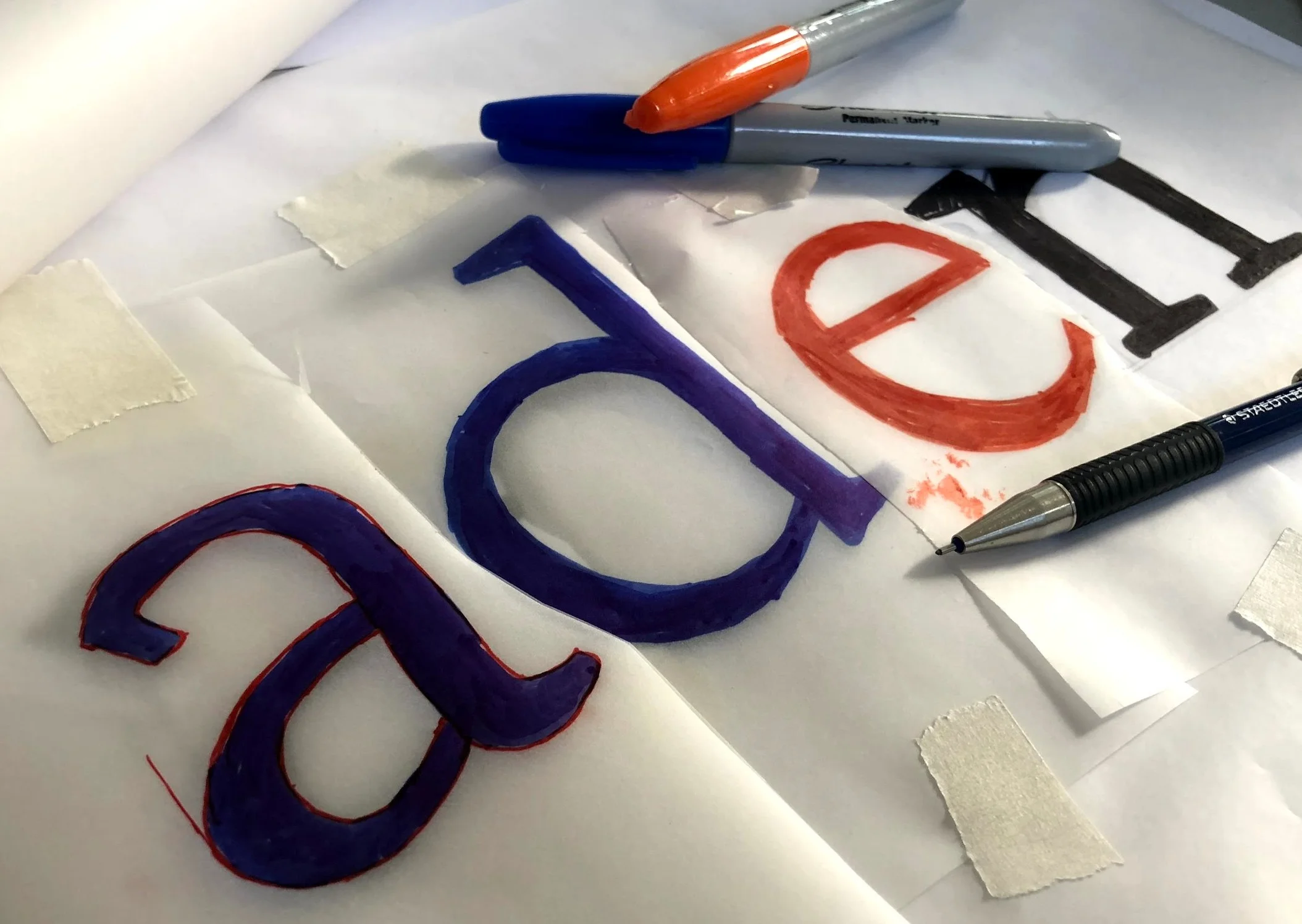
After finding inspiration for a typeface (see the previous blog post) we can start to sketch our typeface design. I prefer to loosely sketch my designs, so I have a general direction, and perfect the design on the computer. I like to sketch on my iPad, I find it is faster, but pen and paper work just as well or sometimes even better. I recommend using whichever you find the most comfortable. If you use pen and paper use a sharpie, not a pencil or a pen. The goal when sketching is to get an impression of how the letters will look. The darkness of sharpies is the best way to approximate the final impression of type. It also allows you to not worry too much about being perfect, instead, you just want to get the general shape and revise afterward. When I work on paper, once I have a general sketch I will go back with tracing paper or whiteout to refine my letters.
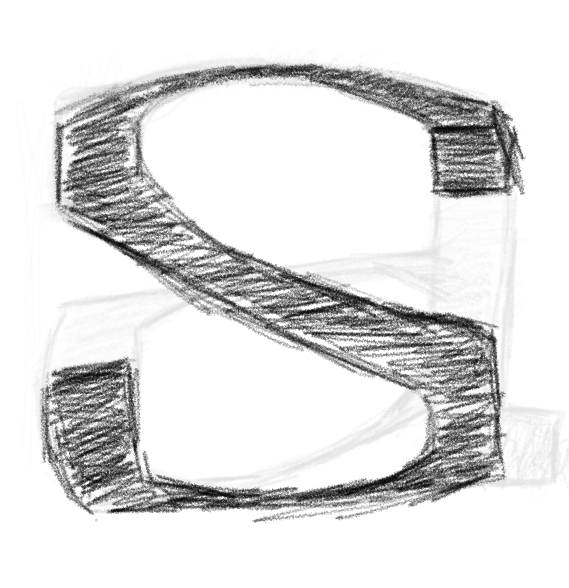
There are two different ways to begin drawing your typeface. One is to draw the skeleton (an inside line) of the letter and then sketch the outside shape around it. The second option, which most designers will tell you is the correct way, is to begin to shade back and forth the shape of your letter (image to left). This method of shading in the general shape of the letter is a quick way to understand what the shape will look like. The most important part when sketching is to make sure that the inside of the letter is filled in, this provides the most accurate view of the final shape, because your letters are always black.
When beginning to sketch a typeface there are lots of reference words people use (adhesion, hambergerfontsiv, handbreak) all of these words work, it is more a matter of preference. Each of these work because they have a wide variety of characters, there are round characters (o,e) more square characters (n,m) as well as ascenders, (d,h,b, etc.), and two story characters (a,s). Having the general design for a wide variety of characters makes it easier and faster to build out the rest of your typeface.
When I begin sketching letters I draw in visual hints such as side bearings, x-height, ascender, and descender so I know how wide I want to draw my letter. These bearings provide a visual queue as to how I should be sketching my letters. I will usually try and sketch out the same character a few times until I am happy with one of my sketches. At this stage I will use either use tracing paper or layers on my iPad, to trace over and refine my design. I will continue to trace over the same character until I am happy with the design, sometimes that means tracing over the same letter 4 or 5 times. I will then use this letter as a template for my other letters. For instance, once the n is designed it is easy to use it to create the h. Tracing over the work you have already done will allow you to work faster; my goal when sketching it to quickly get out my ideas so I can move onto refining them on the computer.
I am not the best at sketching, therefore once I get the general idea of what I want my character to look like I move to the computer. I would rather spend more time tweaking on the computer than drawing. If you prefer drawing and want to spend more time refining letters by hand feel free to revise until you are happy with your design. The more perfected your drawings are when you bring them into the computer the less time you will need to spend refining them once you are on the computer.
Overall this is a general guideline of how I begin to sketch typefaces, it is by no means the only way to do it. At the end of the day, whatever is the most comfortable, easiest, and best suited for your project is the best way to do it. If you want to see me begin to sketch out a typeface check out my latest IGTV video.
Is there anything that I haven’t mentioned that you like to do when sketching out new type? Comment below!


On November 30, 2019, FontLab released its seventh update (FontLab 7). This review of FontLab 7 takes a look at the best and worst features of the software update.