

Headspace
Headspace
As a dedicated daily user of the Headspace app, I've identified a crucial gap in its functionality—the lack of a progress tracking feature. This oversight has inspired me to redesign the app's user interface, making it a personal mission to enhance the overall user experience. My aim is to introduce an intuitive progress tracker that not only reflects my journey from a beginner to an advanced level but also lets users immediately pick up and continue their progress. Ironically the flaws in the design of the Headspace app create stress because users aren’t able to easily keep up with the progress they have made.
The Problem
Headspace, upon new user registration, encourages starting with 'The Basics,' a set of 10 introductory meditation courses. However, the app falls short in guiding users through its foundation courses, (“The Basics 1-3” and “Pro Levels 1-8”). The core issue lies in the app's design: when a user opens the app to start a new lesson, it fails to prominently display the next session in the series. Users are left to sift through a vast array of hundreds of classes or delve into their history to find their next step. This lack of streamlined progression disrupts the learning experience and hinders users from seamlessly continuing their meditation journey, as well as tracking their progress.

When the app is first opened the “Today” screen offers an assortment of meditations, including the last session completed but doesn’t offer a clear next step in the users meditation journey.
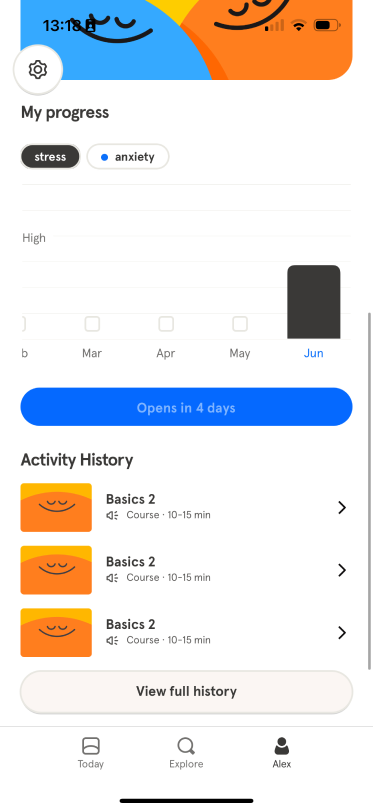
In order to locate the next class users have to go to their profile scroll to the bottom and look through their “Activity History” to see their most recent courses.
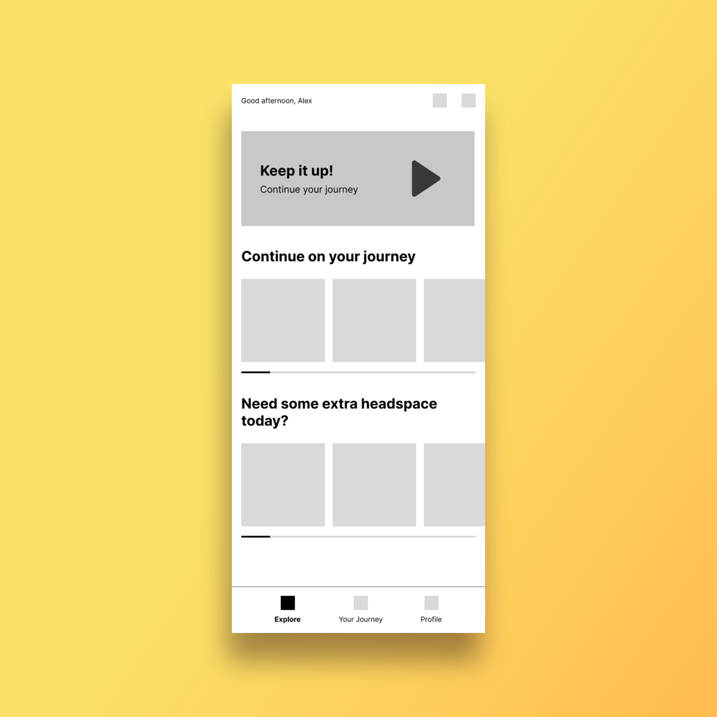
Wireframes
To enhance the user experience while maintaining a simplistic interface, the “Today” tab has been transformed into the “Explore” tab. This revamped Explore section is designed to offer a dual focus: firstly, it emphasizes the user's personal progress, and secondly, it showcases the extensive range of courses available in Headspace. Additionally, the second tab has been restructured to present a more linear and coherent view of the user's journey. It now clearly displays the classes the user has completed and outlines the subsequent classes in their meditation journey. This update ensures a more intuitive and user-centric navigation experience, making it easier for users to engage with the content and track their progress."
Explore
The redesign of the initial loading screen into the “Explore” page marks a strategic enhancement in user engagement. This newly conceptualized Explore page serves a dual purpose. Firstly, it offers users a personalized section where they can effortlessly find their next class in their current series. Secondly, it opens up avenues for discovery, showcasing the diverse range of other classes and content available on Headspace. Positioning the Explore page as the first point of interaction is a deliberate move to increase user engagement. It not only welcomes users with their ongoing journey but also captivates their interest with appealing new classes and features. This approach is designed to encourage users to spend more time on the app, engaging with its content and deepening their meditation practice

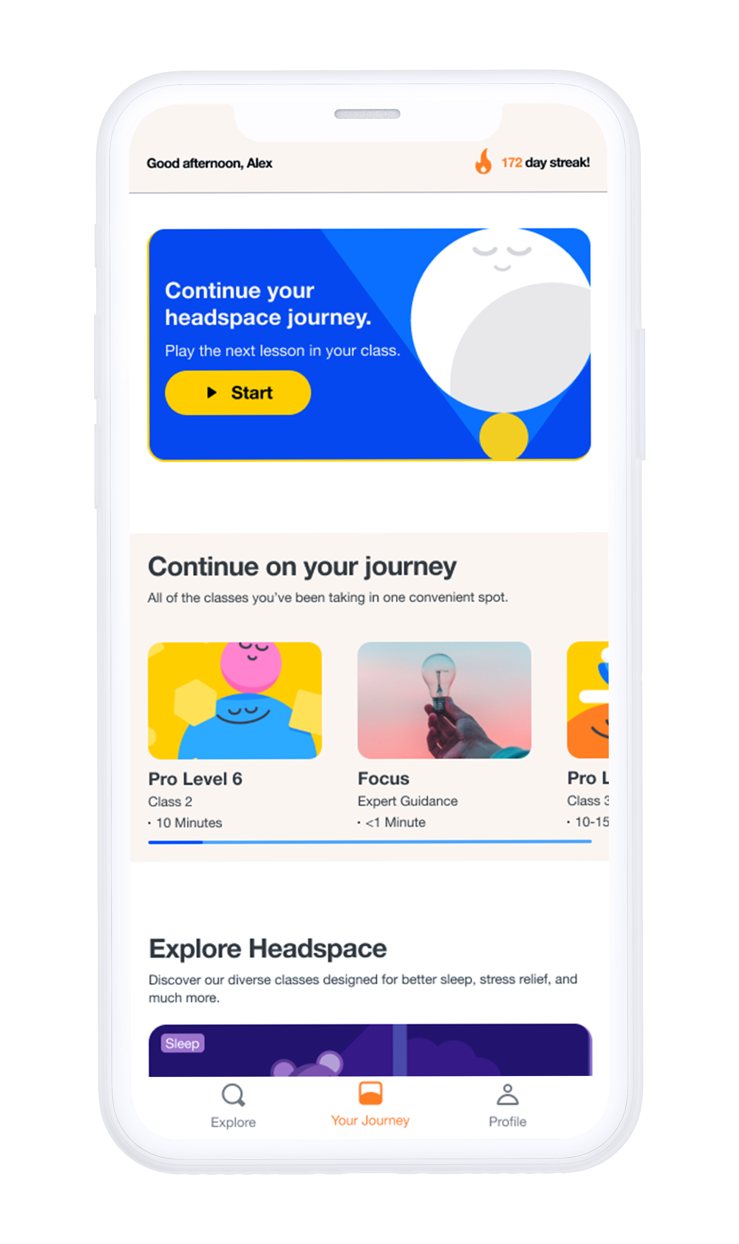
Your Journey
The “Journey tab” is designed with an exclusive focus on the user's individual meditation path. This tab simplifies the process of choosing the next class by clearly outlining the user's current position and upcoming sessions in their meditation series. More than just a navigational tool, it also serves as a platform to celebrate the user's achievements and provide motivational encouragement throughout their meditation practice. Drawing inspiration from apps like Duolingo, which effectively reinforces daily usage habits through its user interface, the Journey tab aims to foster a similar habitual engagement in meditation. By emphasizing the user's personal meditation journey, we facilitate the development of a consistent and meaningful meditation ritual, enhancing both the practice and experience of mindfulness.
Final design

Explore
In the revamped homepage, users are immediately welcomed with a prominent 'Continue Where You Left Off' button, providing direct access to their next session. Below this, a streamlined display showcases the upcoming courses in their meditation journey, allowing for a quick glance at future classes or the option to delve into advanced lessons.
As users scroll down, they encounter a masonry grid layout, presenting an array of Headspace classes covering a broad spectrum of topics, inviting exploration and discovery, in order to boost engagement and time spent on the app.


Your Journey
The 'Your Journey' tab is thoughtfully designed to emphasize the user's personal meditation path. It offers a comprehensive overview of all the classes undertaken, along with a clear indication of the progress made in each level. Users have the flexibility to explore in-depth details of each class, allowing them to track their individual progress. Additionally, this tab provides options to revisit previous classes or jump ahead to forthcoming ones, offering a personalized and adaptable meditation experience.
Play around with the prototype
You may have to login to Figma in order to use the prototype