
Blankstreet Coffee
Blankstreet Coffee
As a dedicated member of Blankstreet's Regulars Coffee Program in NYC, I find myself frequenting the same three coffee stores due to my regular schedule. Each day, without fail, I order the same two beverages to kickstart my day. Given the repetitive nature of my coffee orders, I am eager to explore ways to streamline the express reorder feature offered by Blankstreet. With convenience as my priority, an optimal solution would minimize the number of clicks required to place my daily coffee order. In this analysis, I aim to evaluate the current UX flow of Blankstreet's express reorder option and identify potential areas for improvement to enhance the efficiency and user experience of this process.
The Confusion
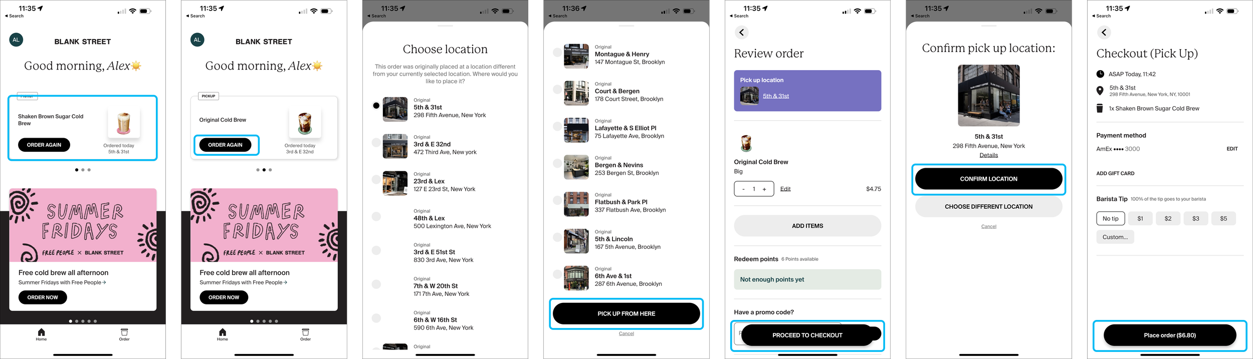
The user flow of the app presents a perplexing experience, lacking consistency and predictability. With five different user flows in rotation, each time a user logs into the app, they are confronted with uncertainty about which specific flow they will encounter. This variability creates a confusing landscape and leads to bad user experiences. The lack of a standardized navigation and varying processes across the different flows leave users feeling disoriented and unsure about what to expect. To deliver a more satisfactory user experience, it is essential to address these issues and establish a coherent and intuitive user flow that remains consistent throughout the app.
Flow 1
Same Drink
Same Store
Taps
5


Flow 2
Different Drink
Same Store
Map View
Taps
6
Flow 3
Different Drink
Same Store
List View
Taps
7

Flow 4
Different Drink
Different Store
List View
Taps
7
Flow 5
Same Drink
Different Store
Map View
Taps
6

Flow 6
Different Drink
Different Store
Map View
Taps
5

Flow 7
Different Drink
Different Store
Map View
Taps
6

TL;DR
The user flows in the Blankstreet coffee app exhibit varying levels of complexity and usability. Reordering the same drink from the same store is the easiest user flow, requiring only 5 clicks, but it could benefit from simplifying the information required for express reorder. Ordering a different drink from the same location introduces confusion with two location selection options, and the list view complicates the process by requiring users to identify stores based on cross streets. The map view, on the other hand, provides more useful proximity information. Ordering the same drink at a different store presents similar challenges with location selection. Lastly, the final express reorder option combines all the previous issues, making it the most complex and convoluted user flow. Understanding these user flows provides insights into areas where improvements, such as simplification and preselecting frequent beverages, could enhance the overall user experience of the Blankstreet coffee app.
Streamlining the process

Aiming to enhance the express reorder interface by reducing clicks, I prioritized user choice for in-store and drink preferences. I studied successful strategies from other apps like Starbucks, which smartly ensures correct store selection and employs upselling at checkout, and Chipotle, enabling fast swipe-up reordering at favored locations. Grubhub, meanwhile, balances express reordering with options to add previous orders to the cart, avoiding user overwhelm. These insights guide our goal of balancing choice with a streamlined reordering process.
Wireframes

Home
Since our goal was to create the most effortless and convenient express reorder experience possible, it became evident that the natural place for this feature to reside would be at the top of the home screen, immediately visible as soon as the app loads. This would replace the "previously ordered" section, which was already a duplication of information that exists within the settings tab.
By relocating the express reorder feature to the top of the home screen, we ensure quick access to users' favorite drinks, places, and payment methods—all condensed onto one initial screen. This approach significantly reduces the number of screens users need to navigate through. Users can effortlessly select from a list of their favorite drinks and places without any unnecessary detours.
One essential aspect to highlight is that while we prioritize the streamlined express reorder process, we understand that users may occasionally wish to stray from their most common drinks or places. To accommodate this, we ensure that the order tab remains in the bottom nav, offering users the flexibility to explore other options when needed.

Summary
Once a user has seamlessly selected their preferred drink, store, and payment methods, the subsequent screen serves a dual purpose. Firstly, it provides a comprehensive summary of these selected details, serving as a valuable checkpoint to ensure users are ordering precisely what they intended, with the confidence that their drink is destined for the correct store. This step enhances the overall user experience by preventing unintended mistakes and subsequent frustration.
Moreover, this screen represents an opportune moment to strategically upsell users with enticing suggestions for additional drinks or pastries. By thoughtfully curating these upselling options, we not only enhance the potential for increased sales but also cater to users' preferences, showcasing enticing offers that complement their selected items.
Recognizing that occasional errors might occur during the selection process, we have also incorporated an essential feature on this screen. Users are granted the convenience of effortlessly editing their drink or store preference, allowing for quick and hassle-free corrections should any wrong selections be made.

Checkout
The final screen in the express reorder process serves as a valuable summary, providing users with a clear overview of their order. Designed to be informative and efficient, this screen eliminates the need for users to interact actively while offering reassurance about the accuracy of their selections.
To further safeguard against potential mistakes, an additional layer of protection has been incorporated into this screen. A 20-second load bar is thoughtfully added, during which users can conveniently review their order and, if necessary, make any last-minute adjustments. This feature serves as a crucial safety net, allowing users the flexibility to modify their choices before finalizing the order but also doesn’t require any action if the order is correct.
By combining a user-friendly summary of the order with this protective mechanism, we aim to ensure that the express reorder process is both efficient and error-resistant, ultimately delivering a seamless and satisfying user experience for our valued customers.

Final Design
The redesigned app focuses on enhancing user convenience by allowing them to set up their preferred drinks, favorite stores, and payment methods just once. This feature streamlines future orders, enabling users to swiftly choose from their pre-selected favorites. This approach not only saves time but also simplifies and accelerates the ordering process, making it more efficient and user-friendly.

The app offers users the flexibility to add drinks they've previously enjoyed, which the app intelligently recognizes as their favorites. Additionally, it provides the option to create fully customized drinks, catering to individual preferences and encouraging exploration of new flavors and combinations.

Users can pre-select their favorite stores from a list of nearby locations they have visited before. Additionally, the app offers a map view feature, allowing users to manually select individual stores. This dual approach provides both convenience and personalization in choosing preferred store locations.

The app enables users to set their preferred payment options in advance, streamlining the checkout process. This includes specifying their desired pick-up time for orders, deciding whether to leave a tip, and choosing their preferred payment method. These features are designed to make the coffee ordering experience more efficient and tailored to individual preferences.

Before finalizing their choices as the default for express checkout, users are presented with a summary of their selections. This screen also serves as an opportunity for users to review and adjust their favorite items and pre-selected options, ensuring their preferences are accurately captured for a more streamlined future checkout experience.
Explore the Prototype
You may need to login to figma to use this prototype